


Rethink
/17
live project
Client
Rethink, Solid Digital
Industry
Psyhology, Behavioral Health
Involvement
Brand Identity, Graphic Design, Website Design, Brand Book
task
Rethink is a company that develops platforms focused on psychological and medical support for mental health and behavioral well-being. The project involved updating the main company logo and those of its subsidiary products, creating a unified visual identity, and documenting it in a comprehensive brand book to guide the design of websites across all business areas.
approach
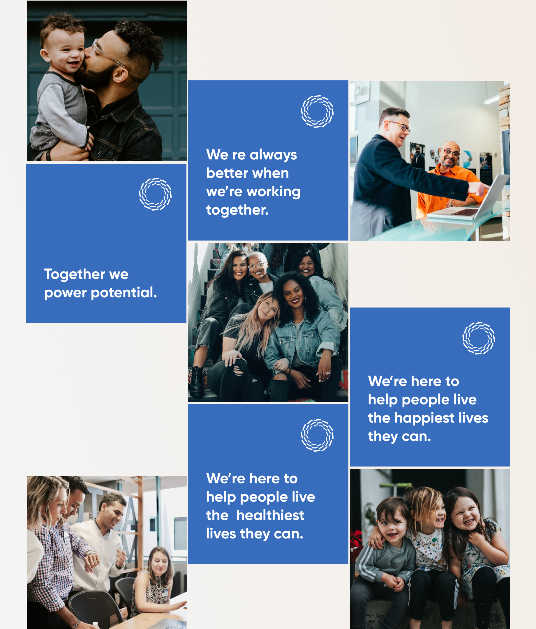
Using a human-centered design approach, I created multiple logo options to give the client choices and clarify their vision for the company’s visual identity. After selecting the strongest concept, I expanded it into a full brand identity and provided designs for social media, websites, and a variety of other materials.
The Most Comprehensive Suite of Behavioral Health Solutions Available. All of the automation tools, clinical content and analytical solutions enterprises need to improve outcomes and impact lives.
Research & Insights
After analyzing the market and the brand’s competitors, I identified the company’s strongest development points - its visual style - and proposed multiple design directions with varied shapes and color palettes to create the most expressive and distinctive brand identity.

Brand Concept & Strategy
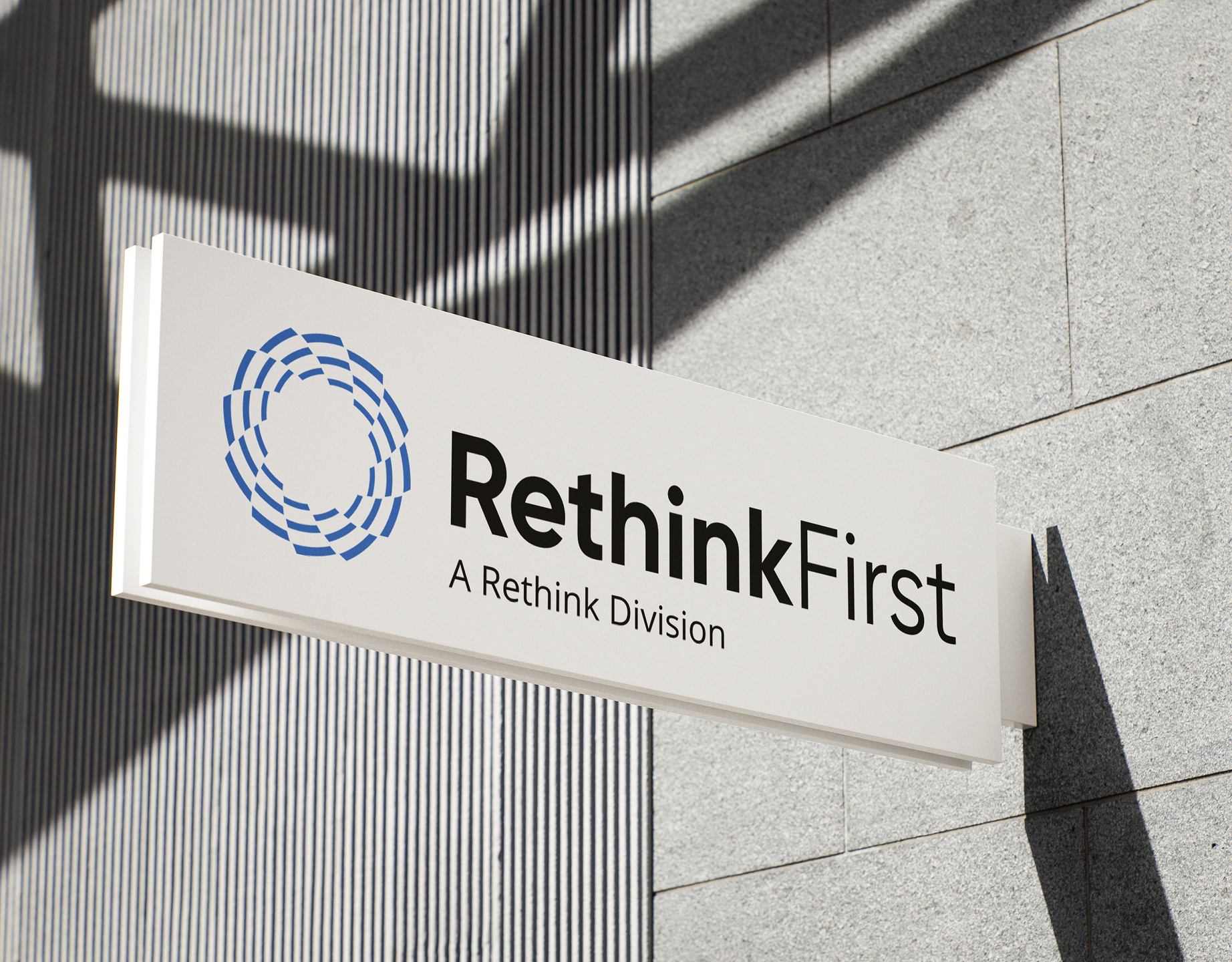
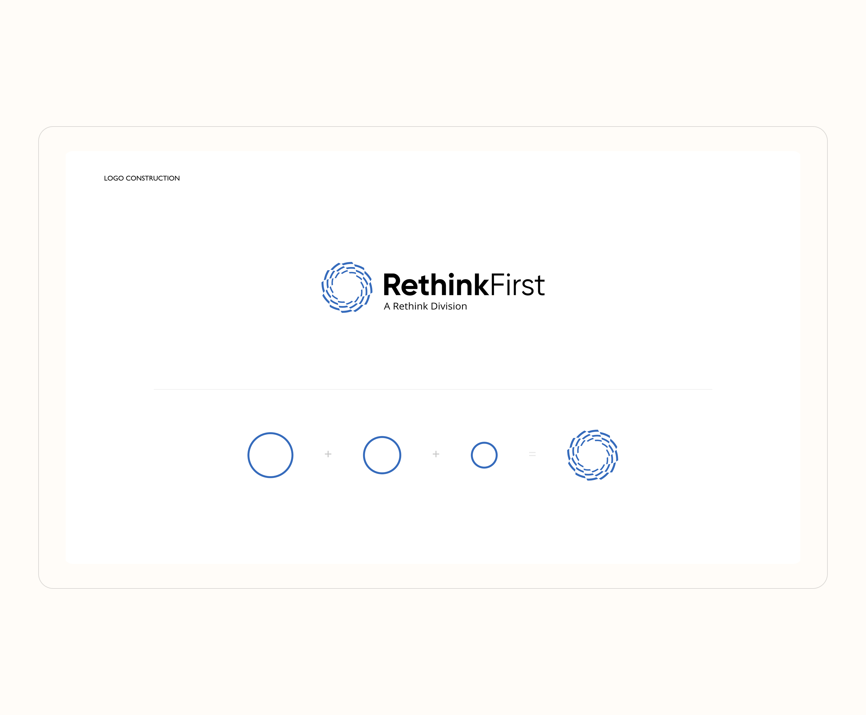
The logo concept was inspired by the word “Rethink,” symbolizing the transformative processes that start from within. Three circles were used, layered and scaled to visually represent personal reflection, daily psychological processes, and their impact on individual well-being, personal growth, group dynamics, and the overall development of the company.
Visual Identity System
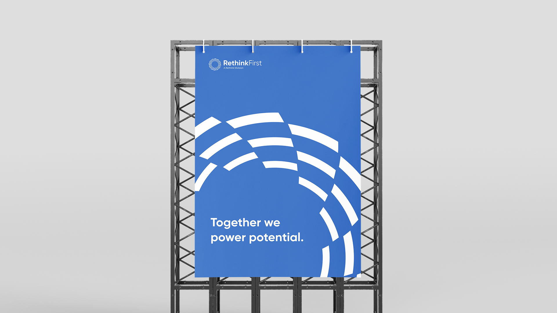
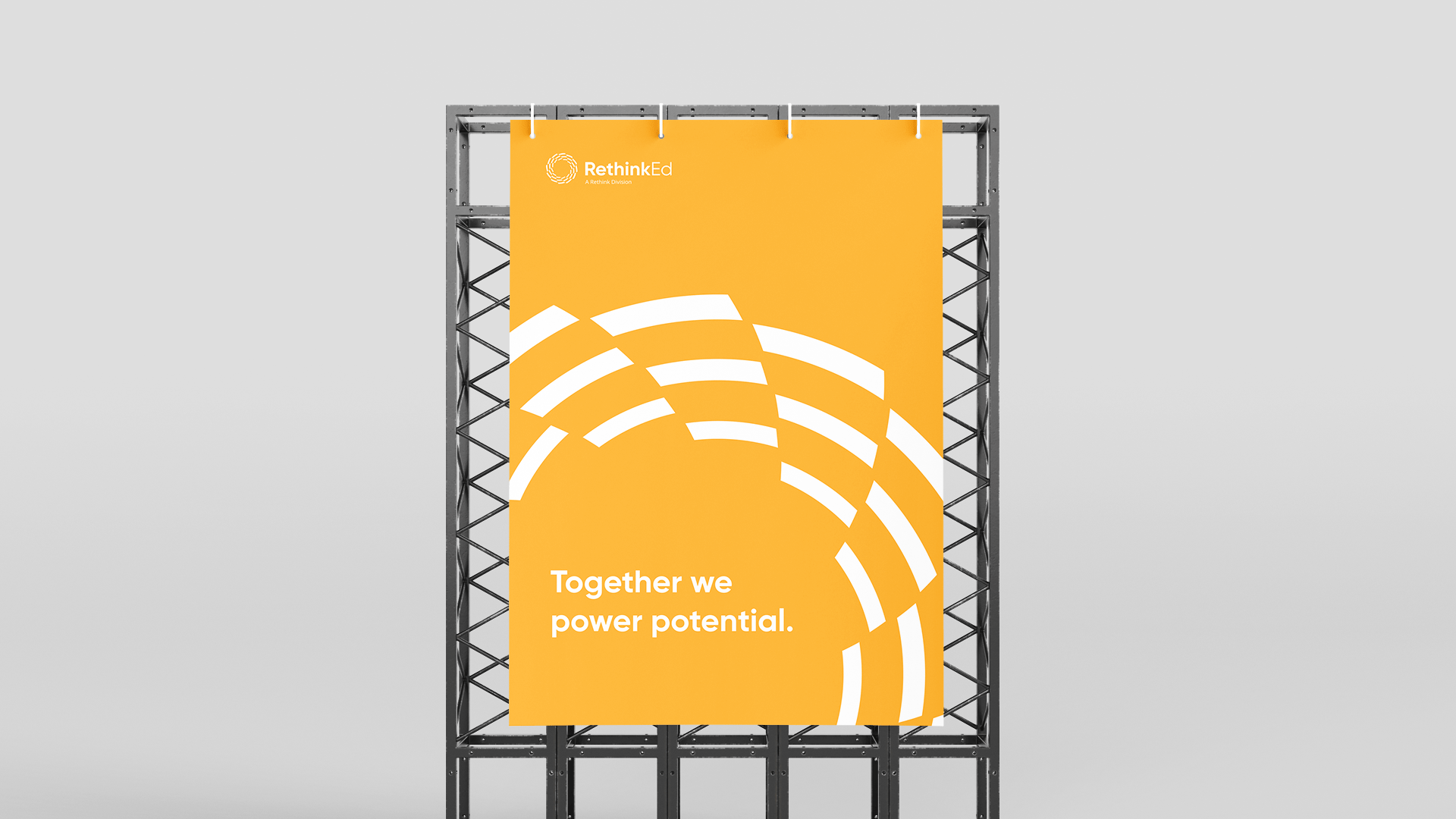
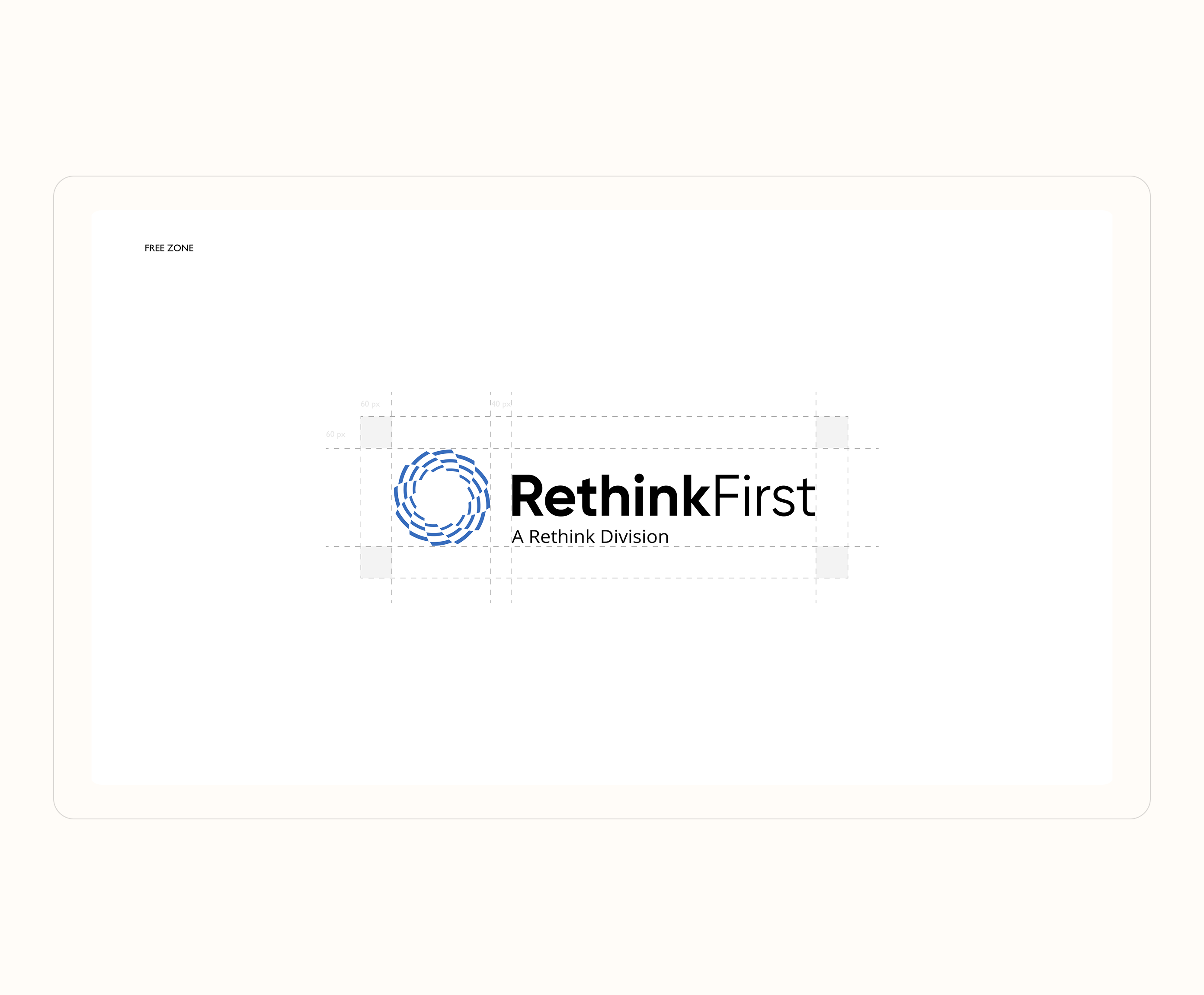
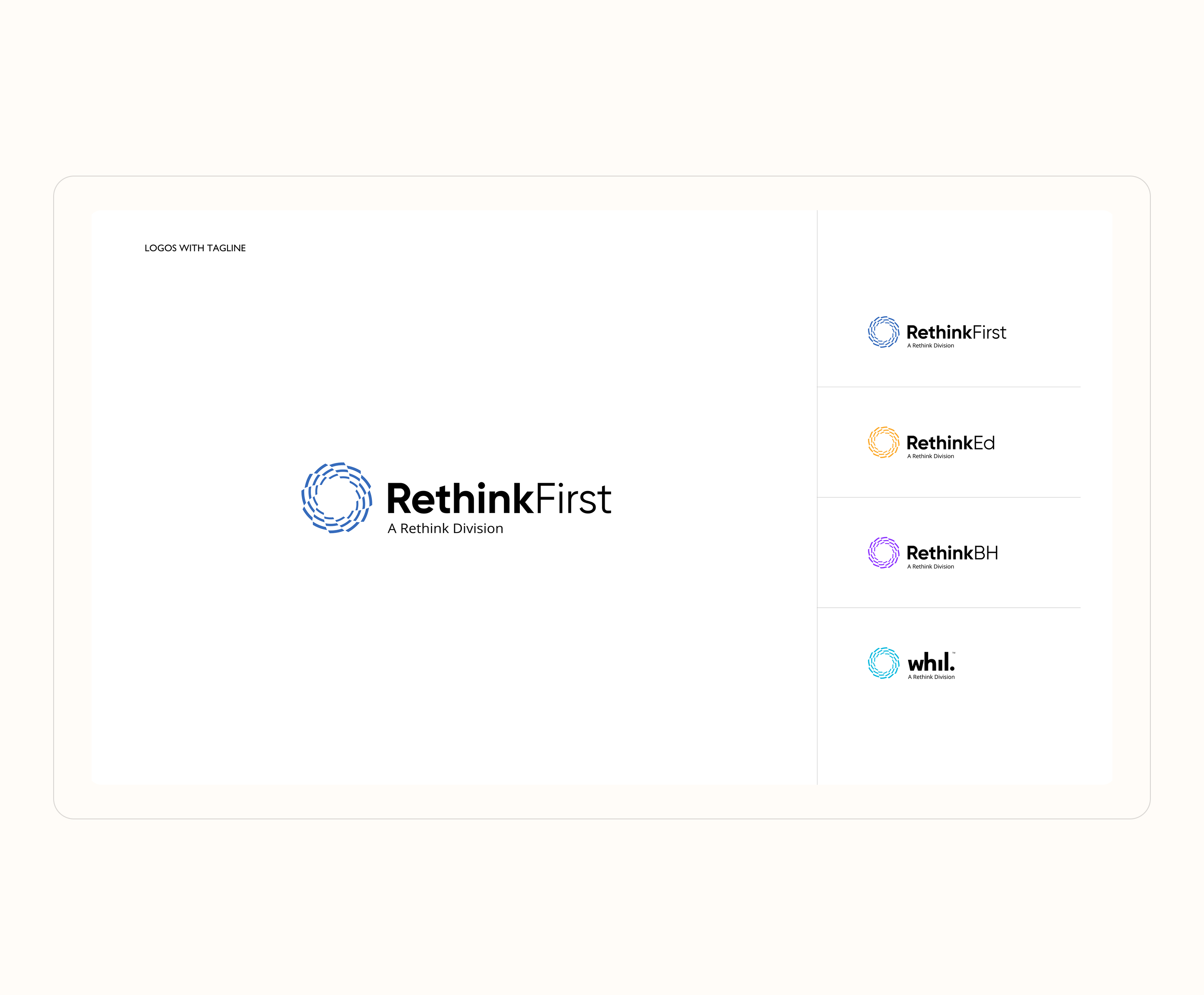
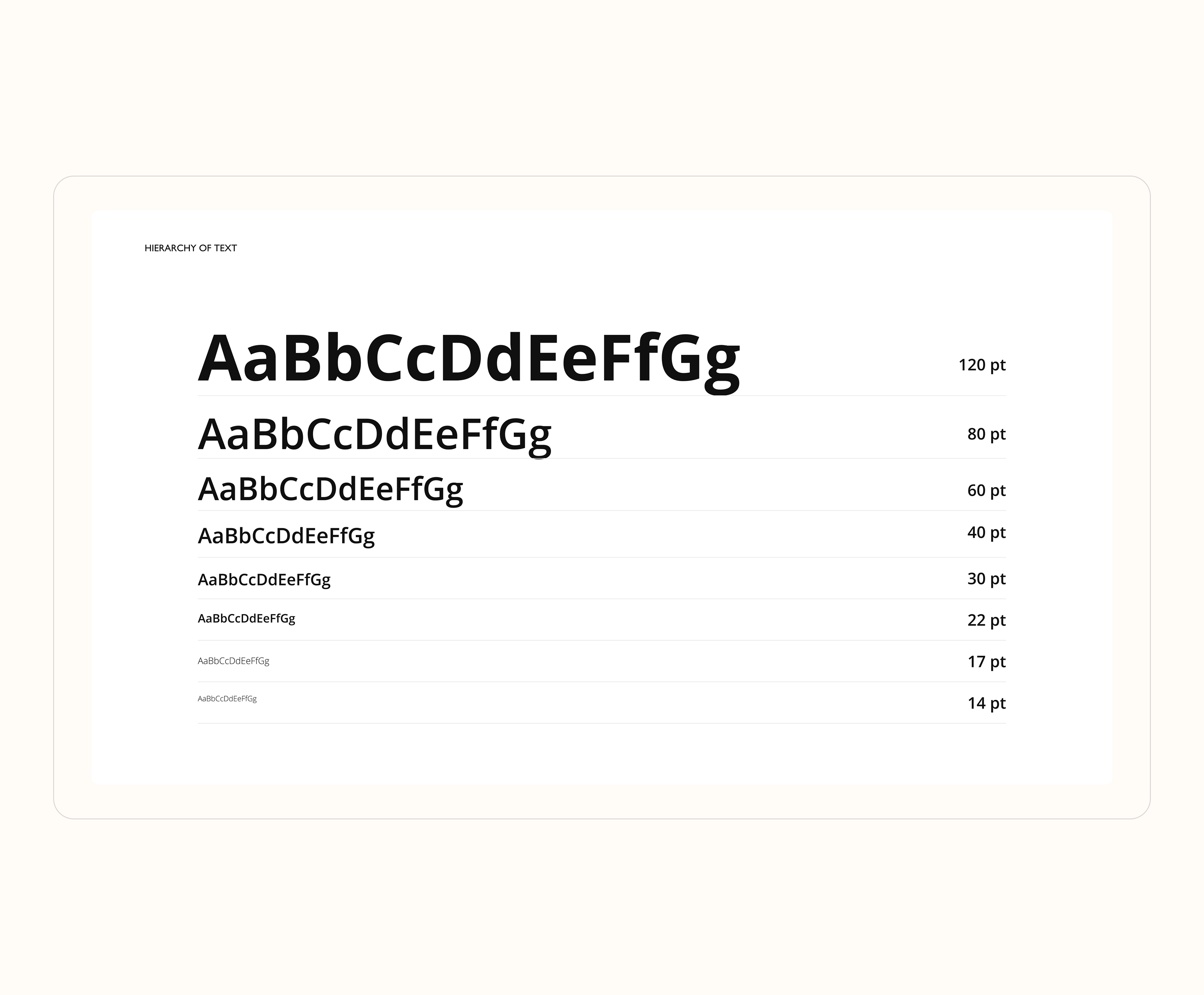
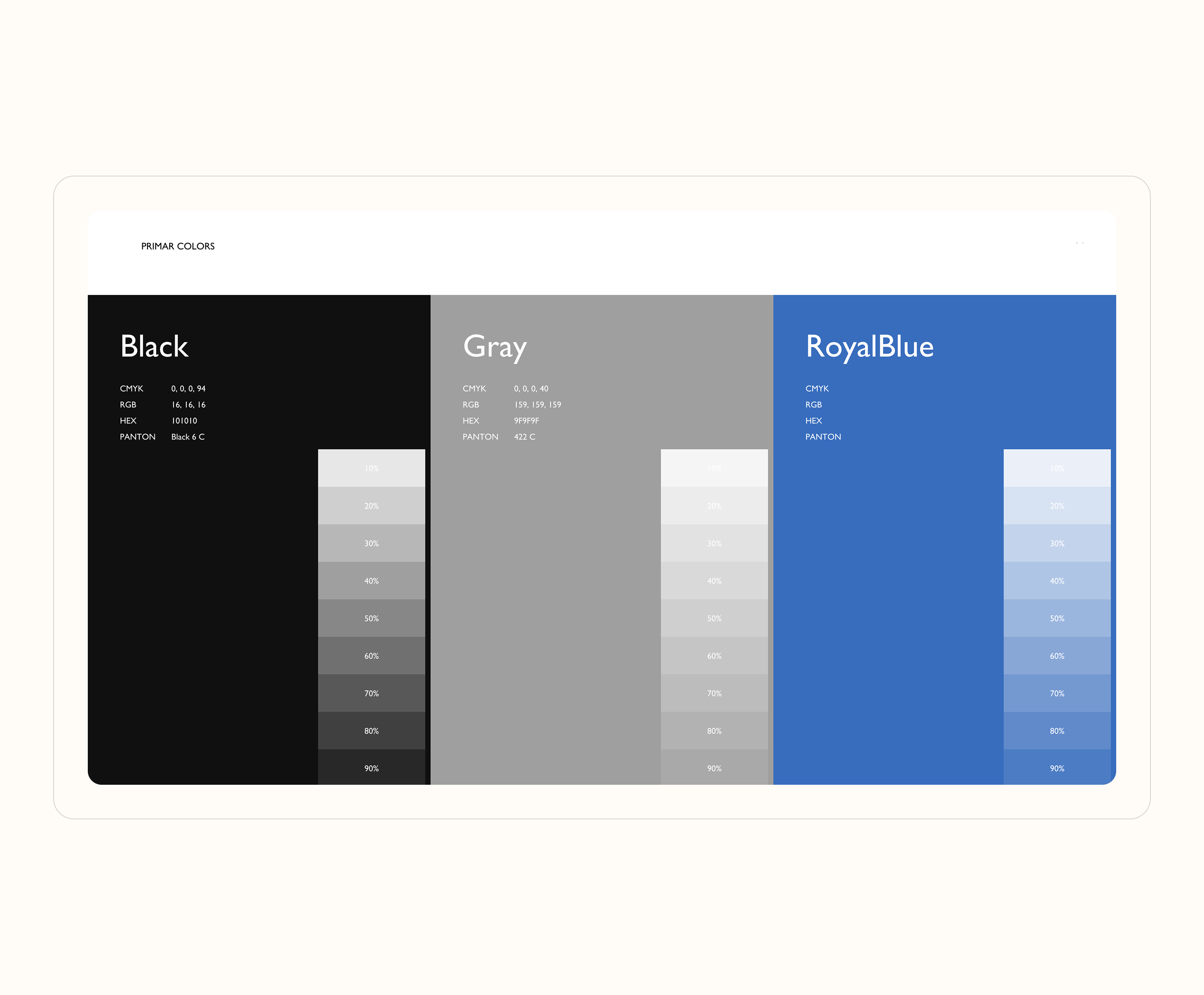
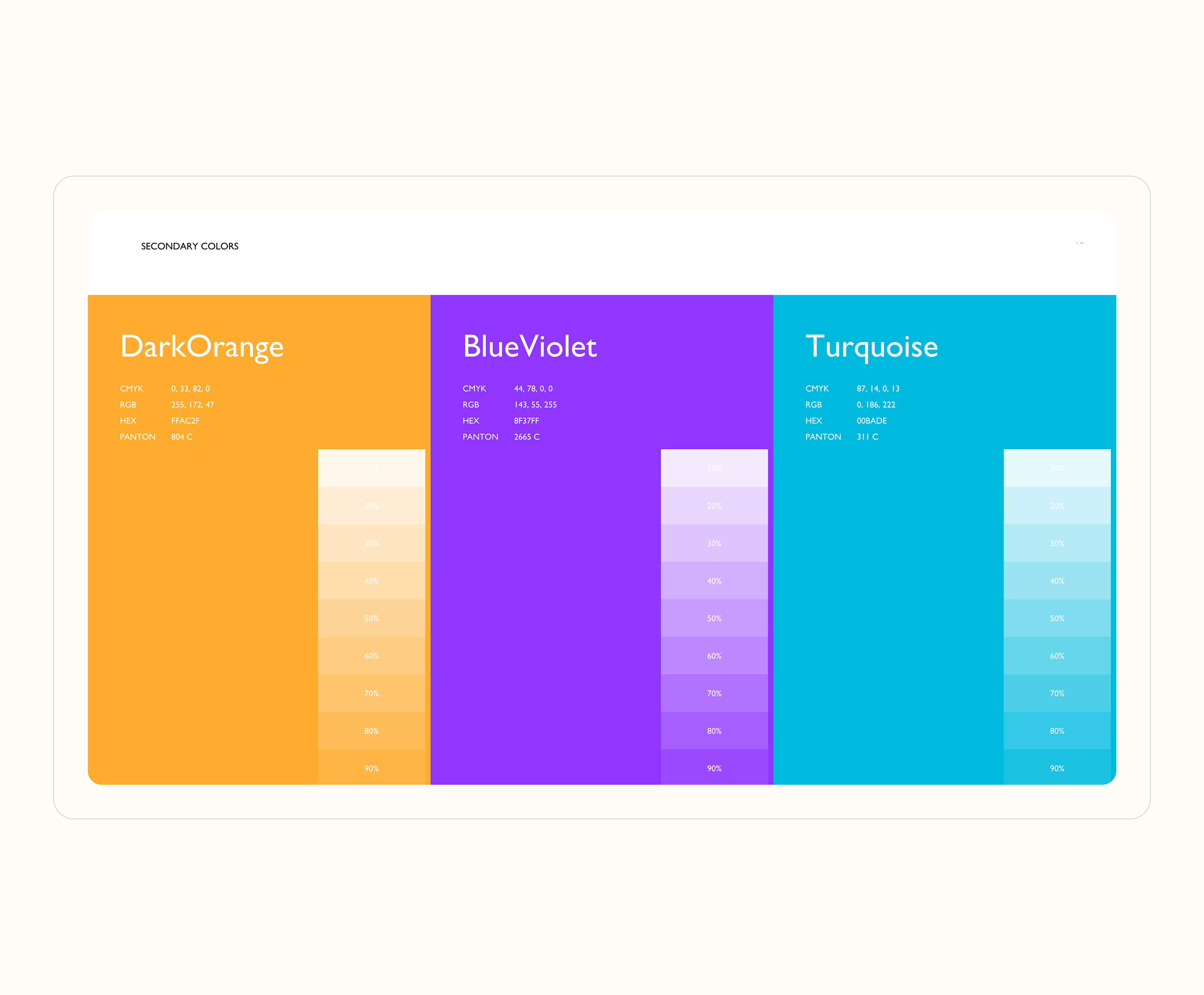
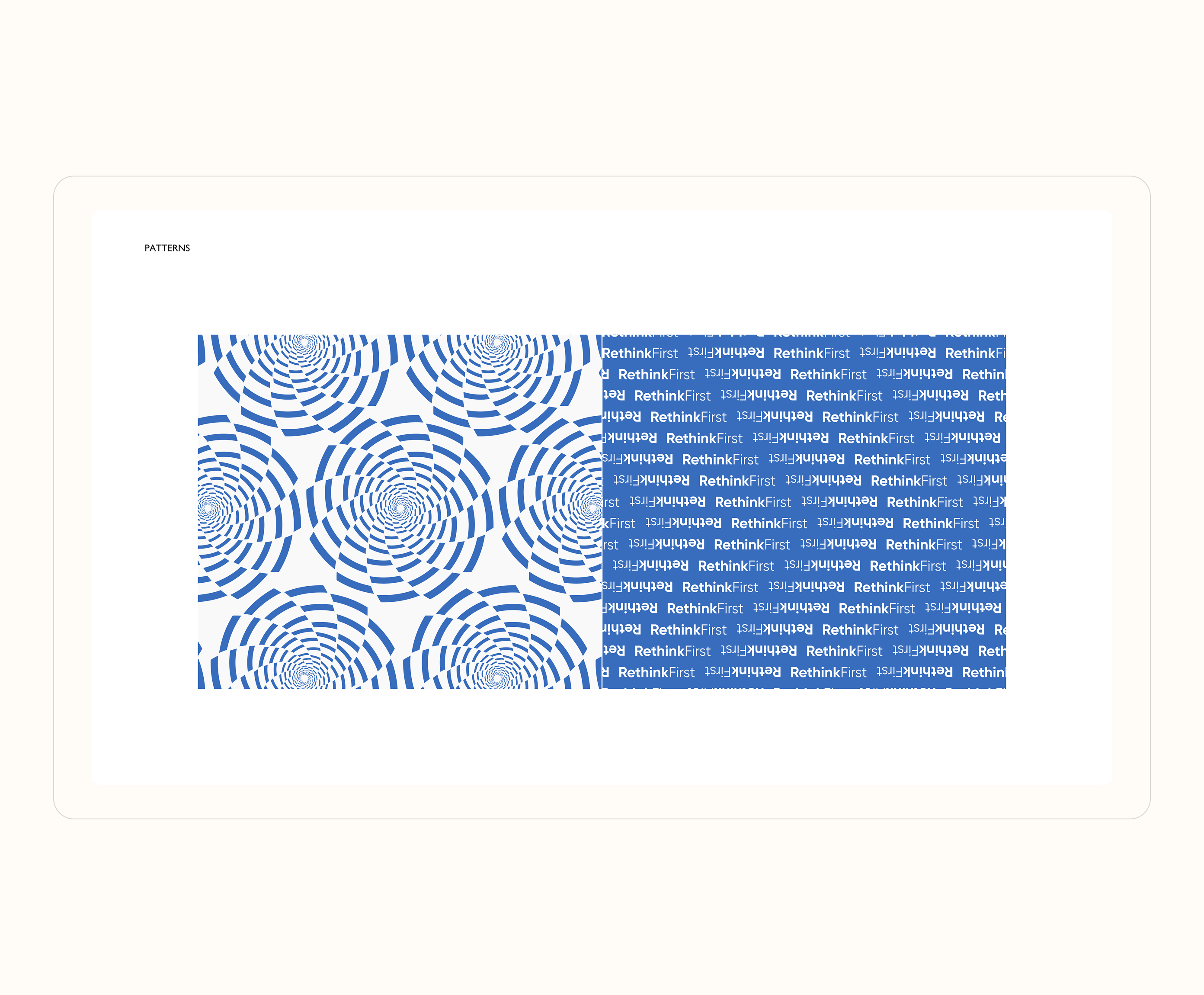
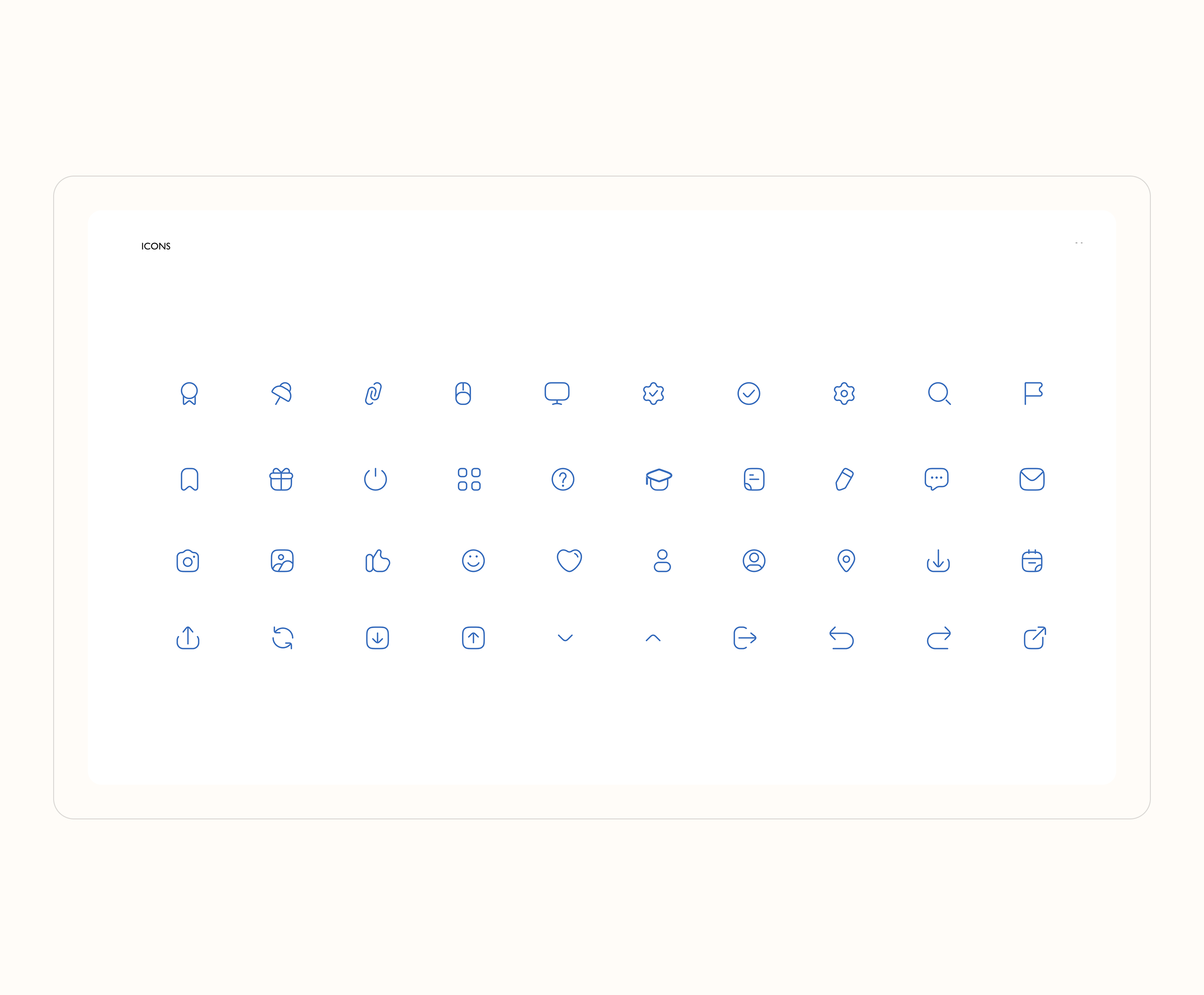
The visual identity was developed following a “simple to complex” approach. It began with the creation of the logo, establishing its forms and basic usage rules. Next, a primary and secondary color palette and a typography system were defined. Subsidiary brands were incorporated with distinctive color variations, and a unified system for applying brand elements was created.
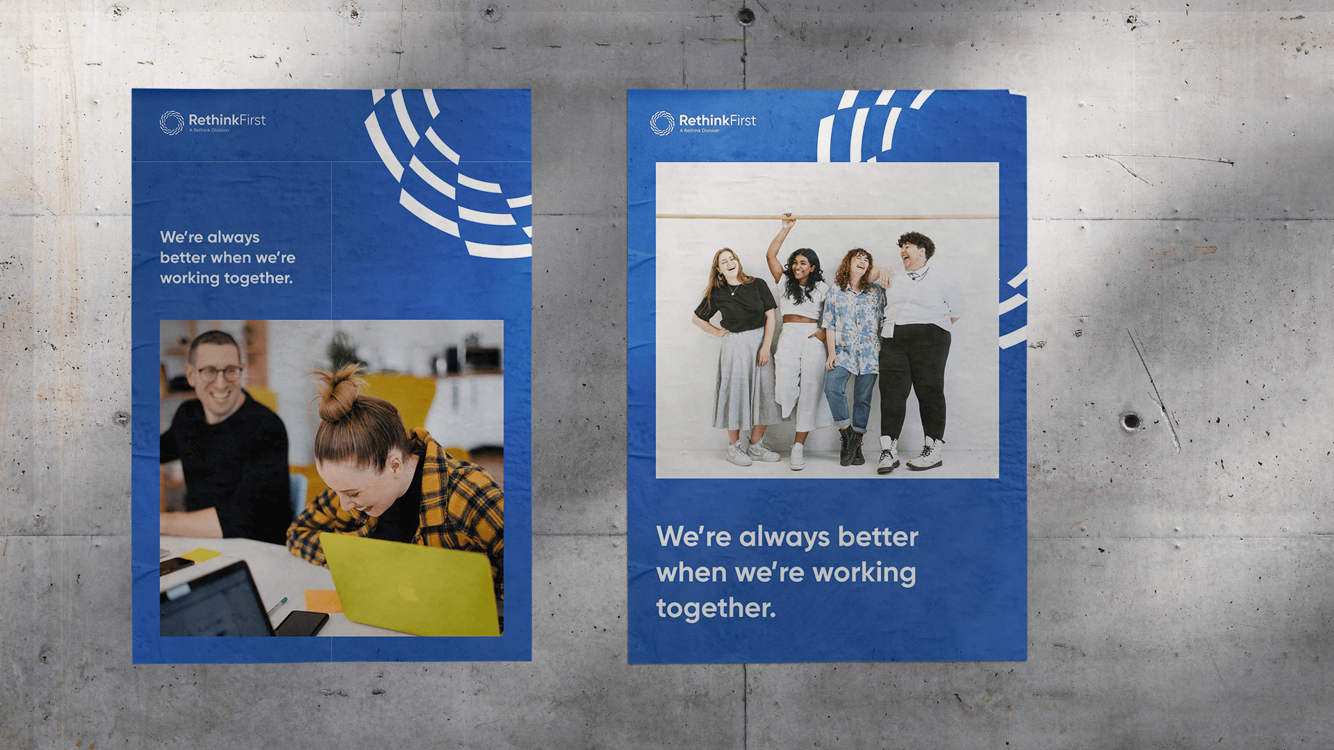
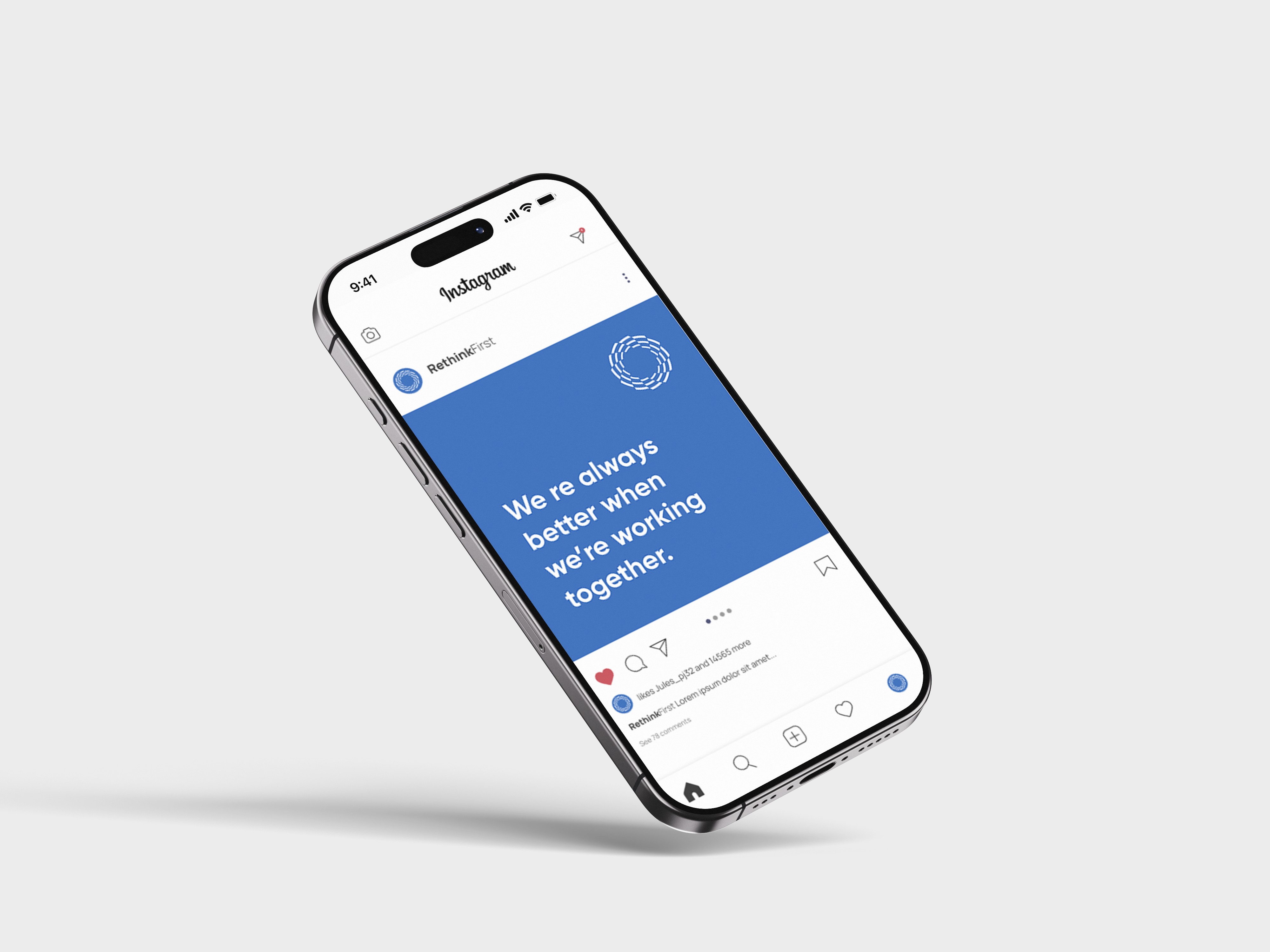
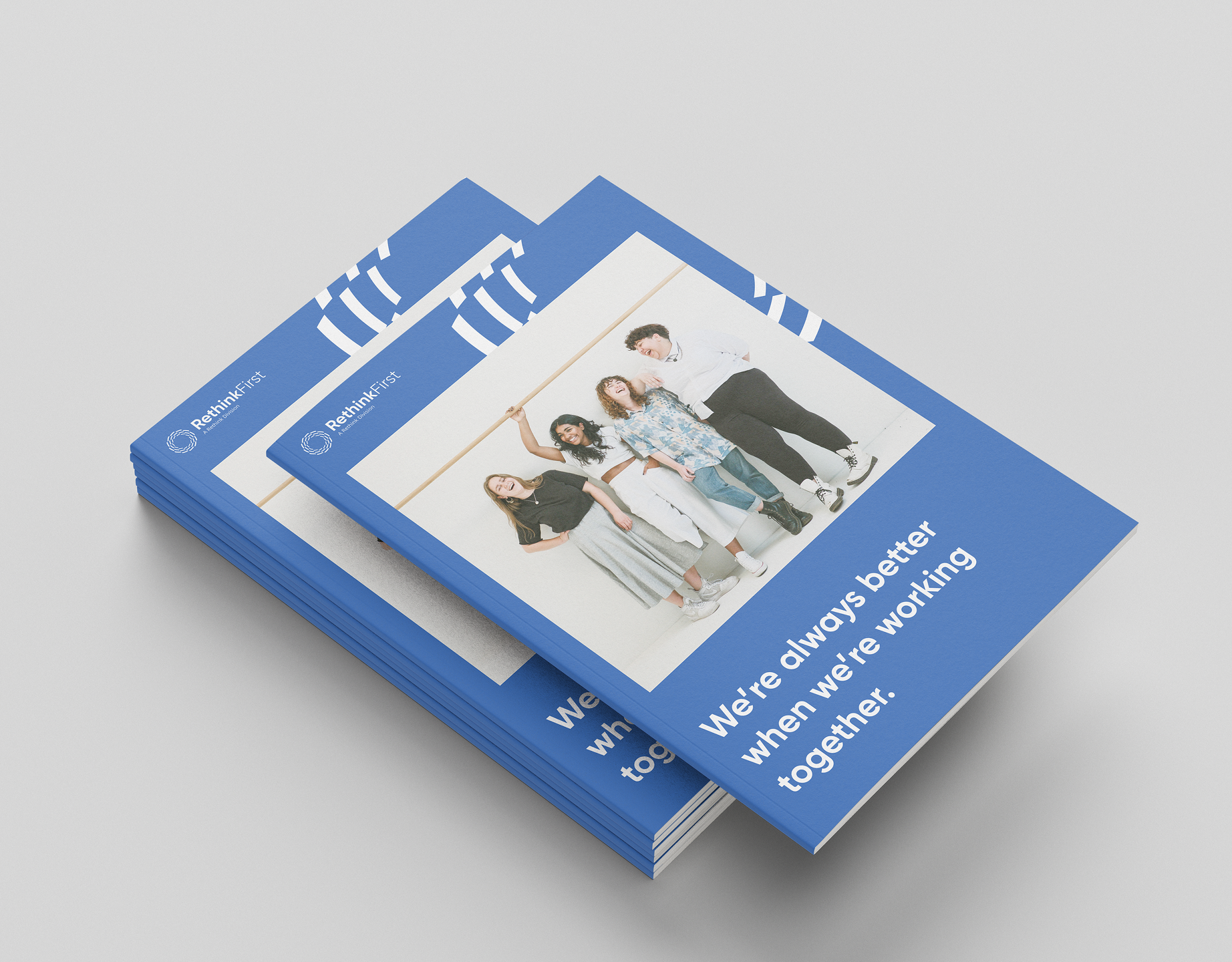
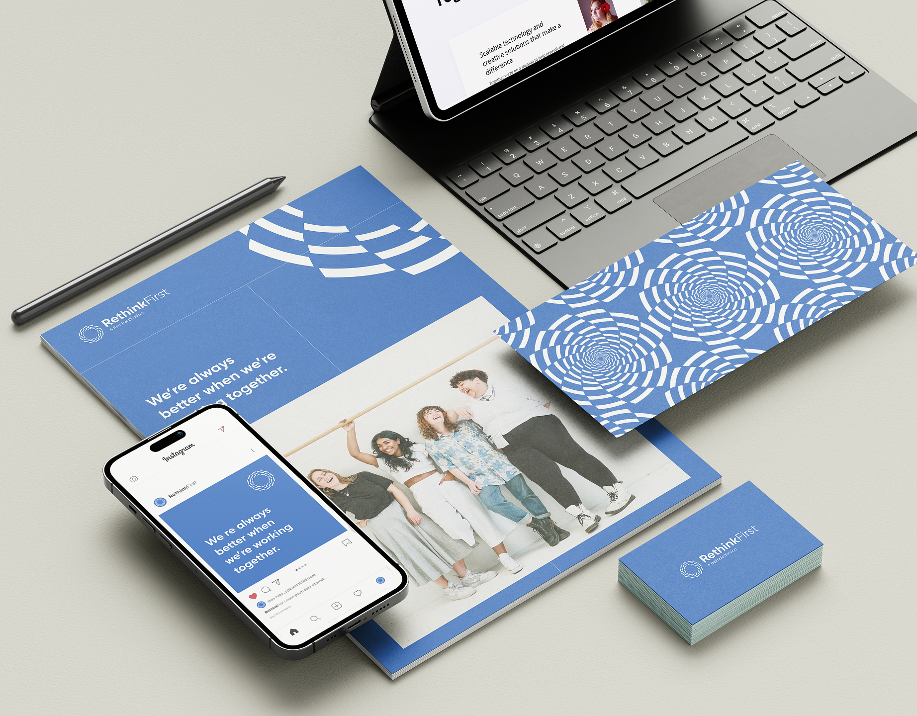
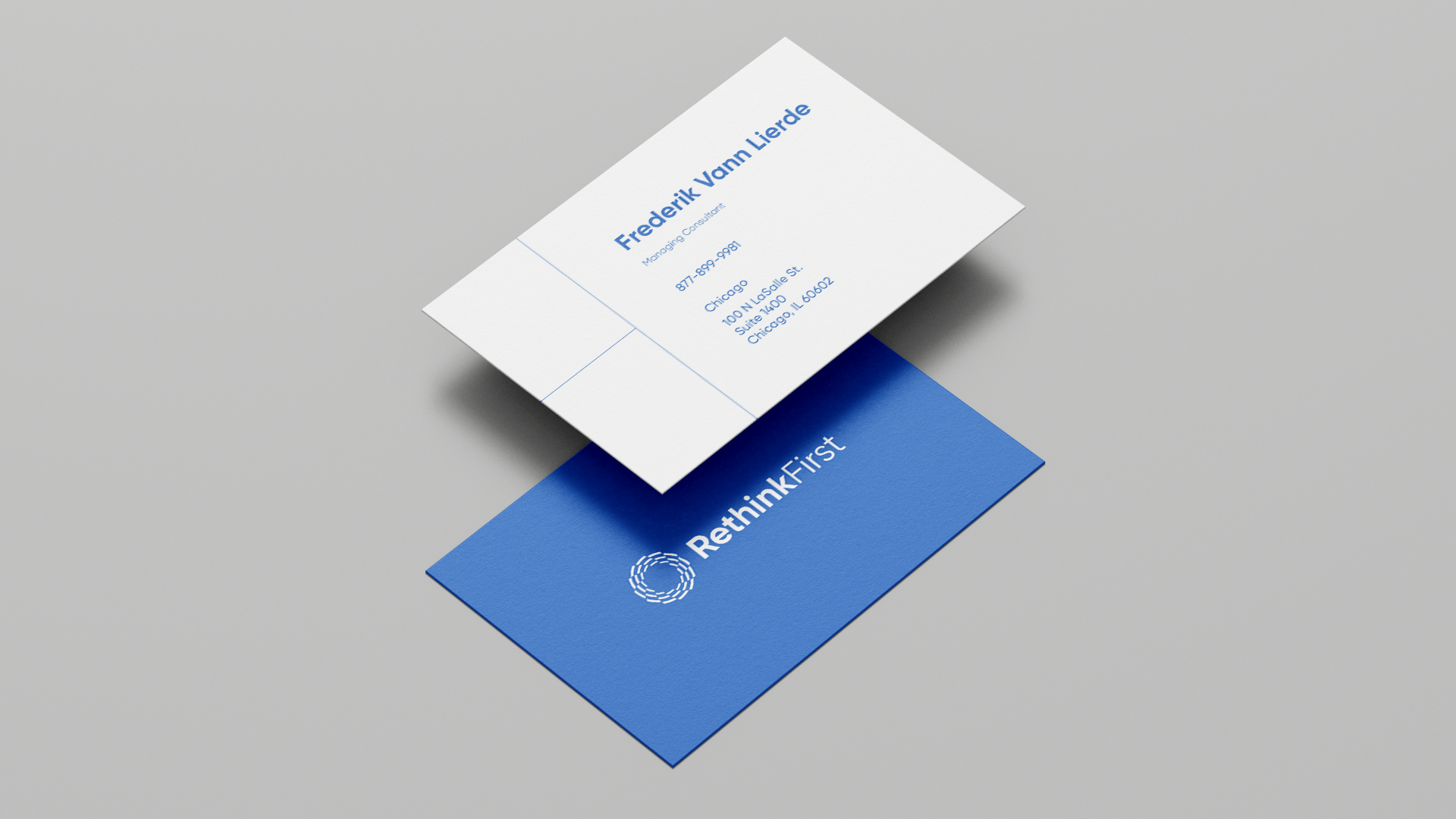
Templates were designed for brochures, business cards, posters, and social media, and this visual style was then extended to the design of both main and sub-brand web pages.
Applications & Brand Book
The project resulted in a comprehensive brand book outlining the brand’s identity, visual elements, and guidelines for presenting the brand consistently across digital and print platforms, along with templates to update and maintain the design style of the company’s websites.
view brandbook



Rethink
/17
live project
Client
Rethink, Solid Digital
Industry
Psyhology, Behavioral Health
Involvement
Brand Identity, Graphic Design, Website Design, Brand Book
task
Rethink is a company that develops platforms focused on psychological and medical support for mental health and behavioral well-being. The project involved updating the main company logo and those of its subsidiary products, creating a unified visual identity, and documenting it in a comprehensive brand book to guide the design of websites across all business areas.
approach
Using a human-centered design approach, I created multiple logo options to give the client choices and clarify their vision for the company’s visual identity. After selecting the strongest concept, I expanded it into a full brand identity and provided designs for social media, websites, and a variety of other materials.
The Most Comprehensive Suite of Behavioral Health Solutions Available. All of the automation tools, clinical content and analytical solutions enterprises need to improve outcomes and impact lives.
Research & Insights
After analyzing the market and the brand’s competitors, I identified the company’s strongest development points - its visual style - and proposed multiple design directions with varied shapes and color palettes to create the most expressive and distinctive brand identity.
Brand Concept & Strategy
The logo concept was inspired by the word “Rethink,” symbolizing the transformative processes that start from within. Three circles were used, layered and scaled to visually represent personal reflection, daily psychological processes, and their impact on individual well-being, personal growth, group dynamics, and the overall development of the company.
Visual Identity System
The visual identity was developed following a “simple to complex” approach. It began with the creation of the logo, establishing its forms and basic usage rules. Next, a primary and secondary color palette and a typography system were defined. Subsidiary brands were incorporated with distinctive color variations, and a unified system for applying brand elements was created.
Templates were designed for brochures, business cards, posters, and social media, and this visual style was then extended to the design of both main and sub-brand web pages.
Applications & Brand Book
The project resulted in a comprehensive brand book outlining the brand’s identity, visual elements, and guidelines for presenting the brand consistently across digital and print platforms, along with templates to update and maintain the design style of the company’s websites.
view brandbook

Rethink
/17
live project
Client
Rethink, Solid Digital
Industry
MedTech, SaaS, AI, Psychology, Behavioral Health
Involvement
Brand Identity, Graphic Design, Website Design, Brand Book
task
Rethink is a company that develops platforms focused on psychological and medical support for mental health and behavioral well-being. The project involved updating the main company logo and those of its subsidiary products, creating a unified visual identity, and documenting it in a comprehensive brand book to guide the design of websites across all business areas.
approach
Using a human-centered design approach, I created multiple logo options to give the client choices and clarify their vision for the company’s visual identity. After selecting the strongest concept, I expanded it into a full brand identity and provided designs for social media, websites, and a variety of other materials.
The Most Comprehensive Suite of Behavioral Health Solutions Available. All of the automation tools, clinical content and analytical solutions enterprises need to improve outcomes and impact lives.
Research & Insights
After analyzing the market and the brand’s competitors, I identified the company’s strongest development points - its visual style - and proposed multiple design directions with varied shapes and color palettes to create the most expressive and distinctive brand identity.
Brand Concept & Strategy
The logo concept was inspired by the word “Rethink,” symbolizing the transformative processes that start from within. Three circles were used, layered and scaled to visually represent personal reflection, daily psychological processes, and their impact on individual well-being, personal growth, group dynamics, and the overall development of the company.
Visual Identity System
The visual identity was developed following a “simple to complex” approach. It began with the creation of the logo, establishing its forms and basic usage rules. Next, a primary and secondary color palette and a typography system were defined. Subsidiary brands were incorporated with distinctive color variations, and a unified system for applying brand elements was created.
Templates were designed for brochures, business cards, posters, and social media, and this visual style was then extended to the design of both main and sub-brand web pages.
Applications & Brand Book
The project resulted in a comprehensive brand book outlining the brand’s identity, visual elements, and guidelines for presenting the brand consistently across digital and print platforms, along with templates to update and maintain the design style of the company’s websites.
view brandbook
