


Neovera
/15
live project
Client
Neovera
Industry
High-Tech, Cybersecurity, Cloud Infrastructure
Involvement
Brand Identity, Graphic Design, Website Design, Brand Book
task
Neovera, a company specializing in cybersecurity and data transformation, needed to create a refreshed brand identity - featuring an updated logo and a new visual style for its social media and website design.
approach
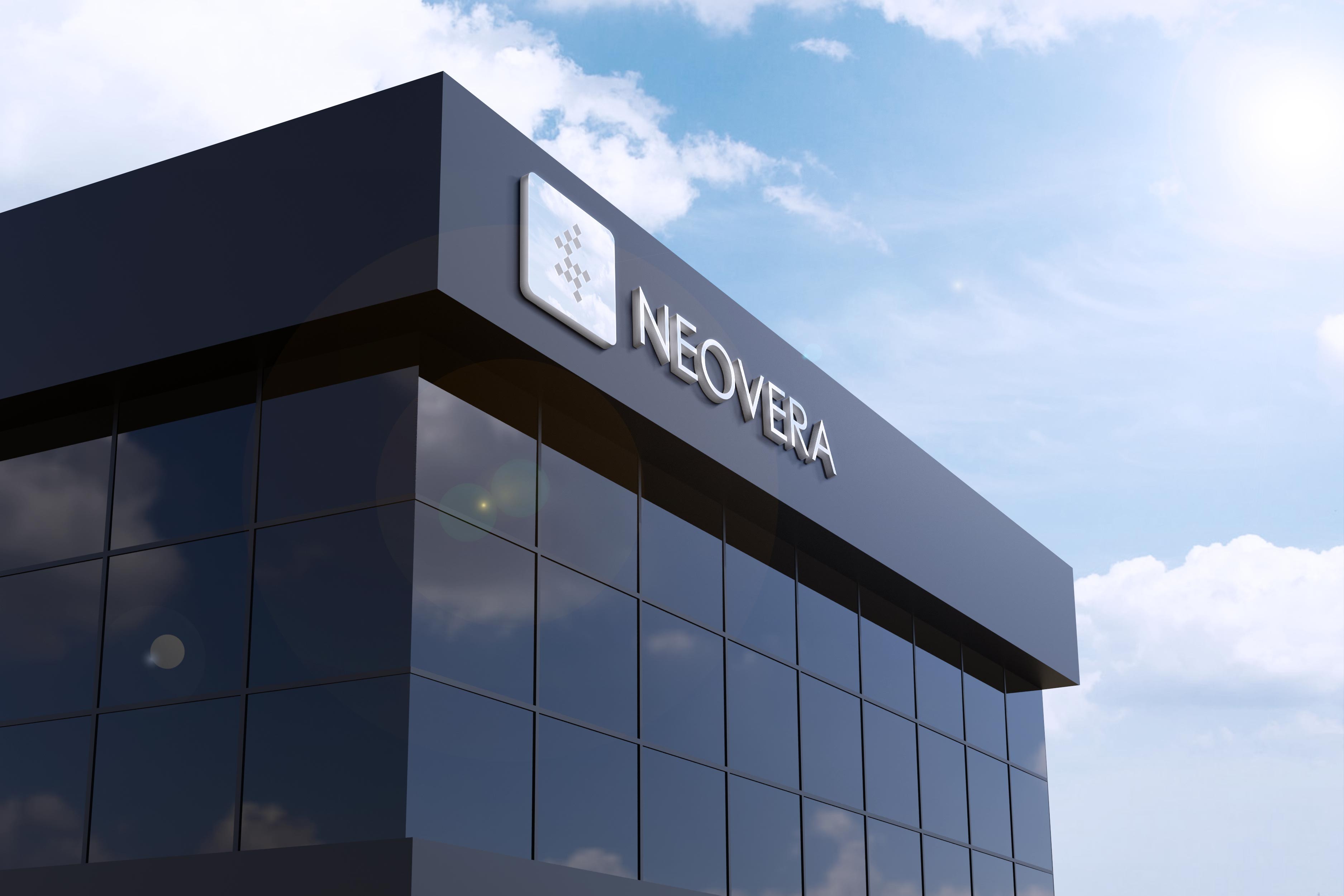
I proposed using the square - drawn from the logo - as the central graphic element to unify the brand. Building on this concept, I developed a range of visual approaches to express the brand identity across different formats, both digital and print.
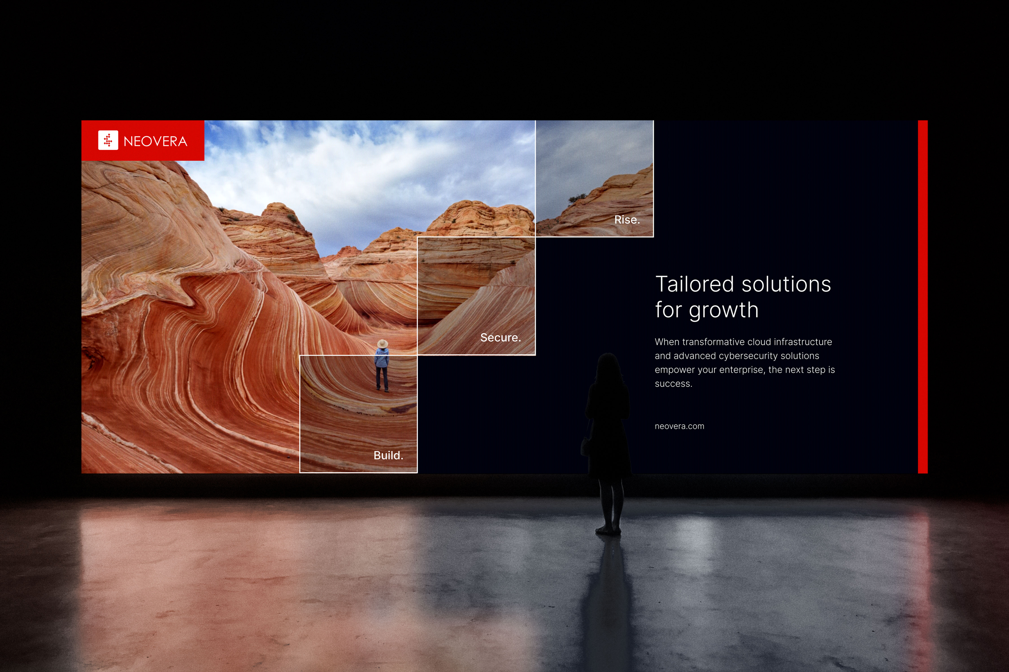
Cloud applications and other new technologies offer massive advantages. You can harness your data in new – and profitable – ways, foster a more efficient workforce, and increase your agility.
Research & Insights
Before the rebranding, the company already had a recognizable identity, including its logo and the use of red as the primary brand color. After researching the specifics of the company’s work and analyzing the competitive landscape, I chose to center the new visual approach around the square as the core graphic element.
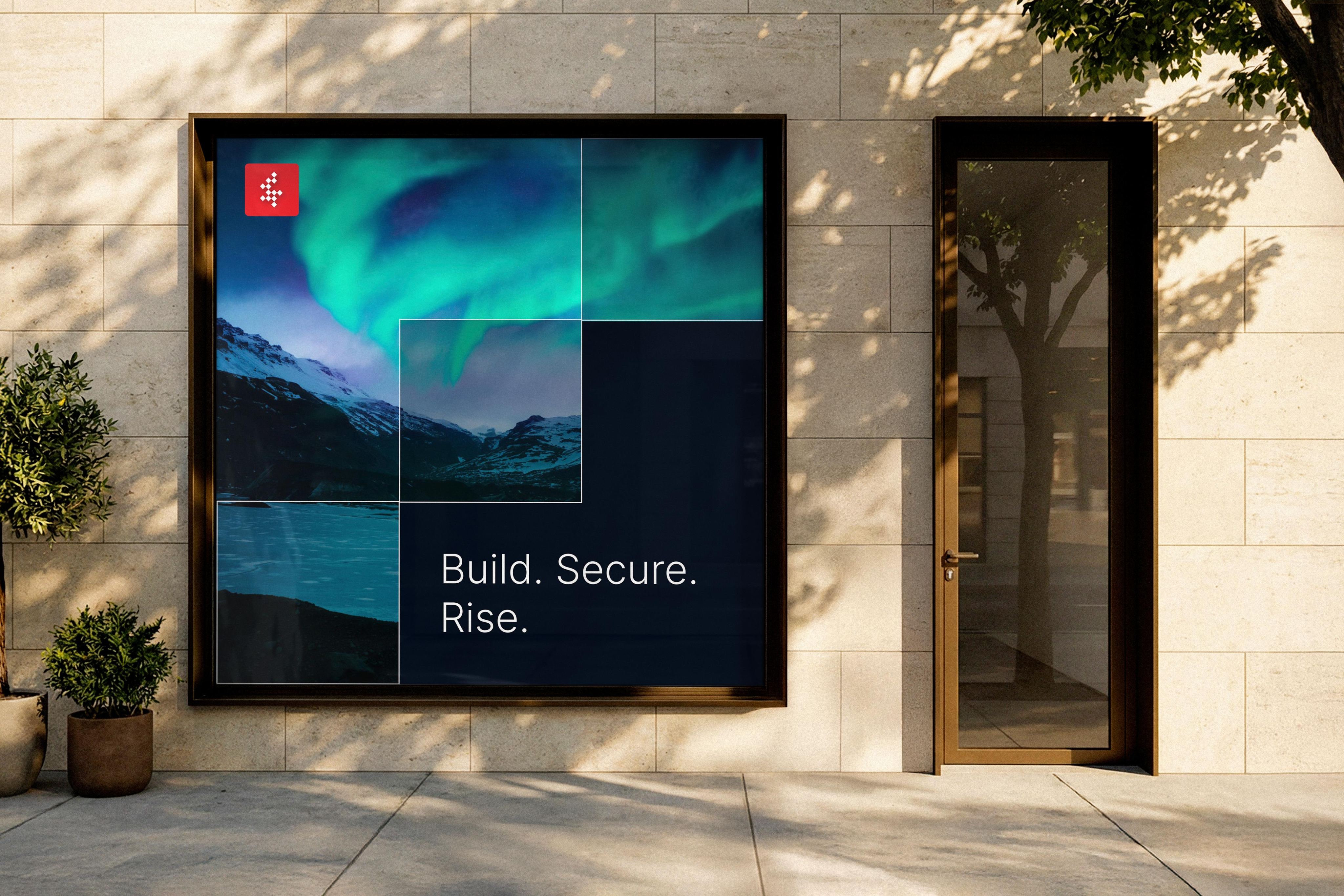
The company also had a slogan - Build. Secure. Rise.” - which can be interpreted as a journey of growth. Based on this idea, I developed a conceptual staircase built from the square form, where each step represents a word from the slogan. This system allows for a visually cohesive design that is easy to scale, adaptable across formats, and effective for both digital and print applications.
Brand Concept & Strategy
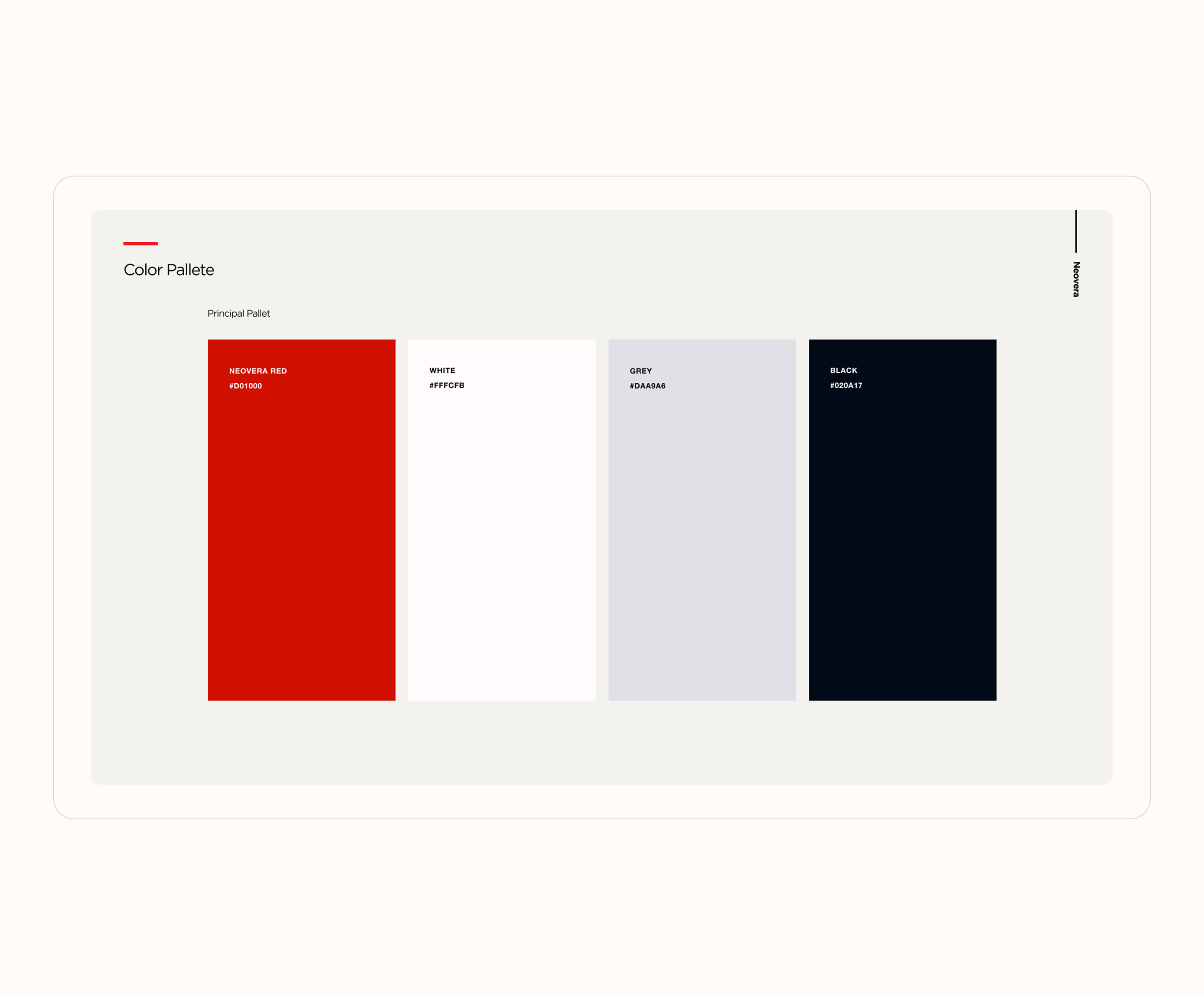
The brand strategy focused on rapidly developing and visually expressing this concept. For the visual communications, I chose a clear, minimal color palette - primarily red and black - to strengthen the brand and convey a sense of recognition, solidity, and stability.
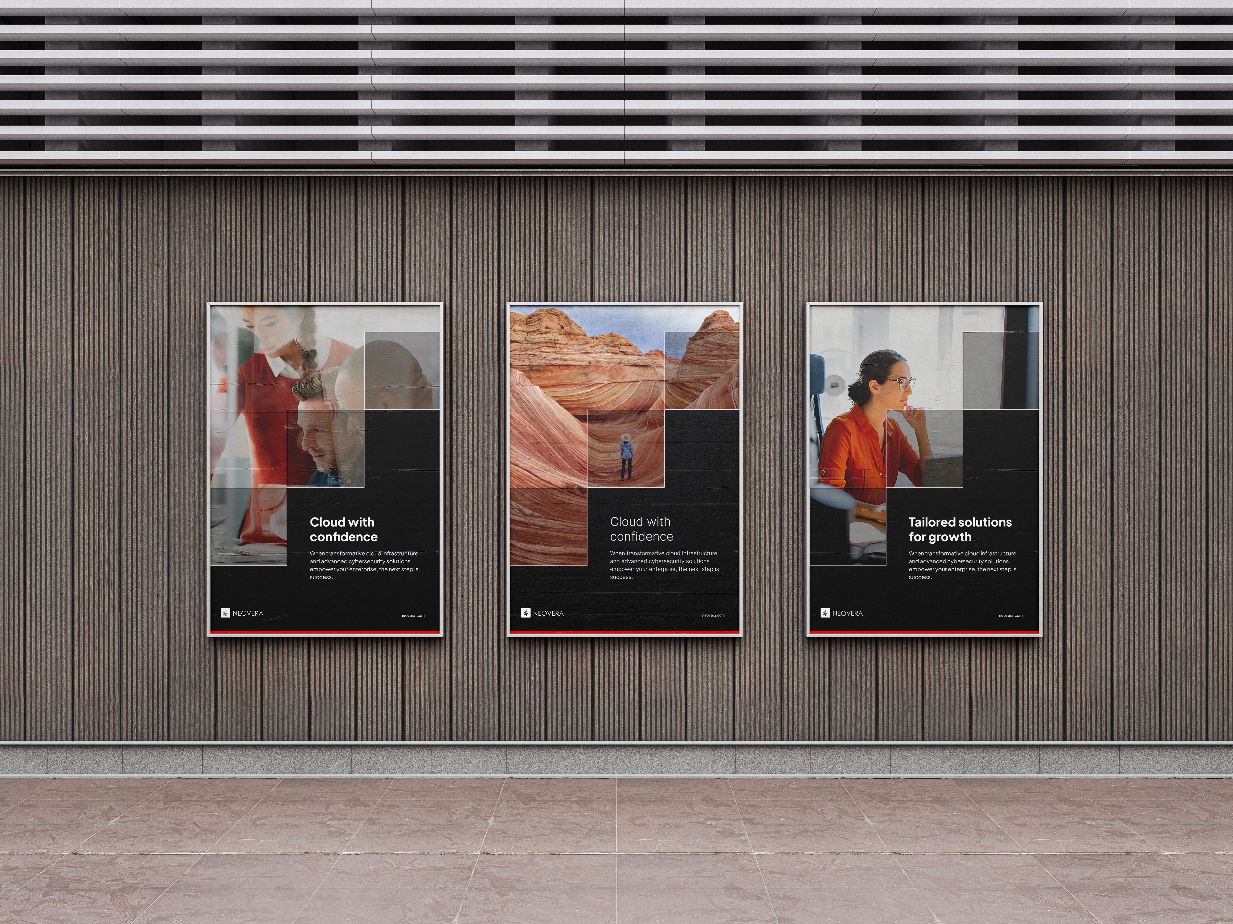
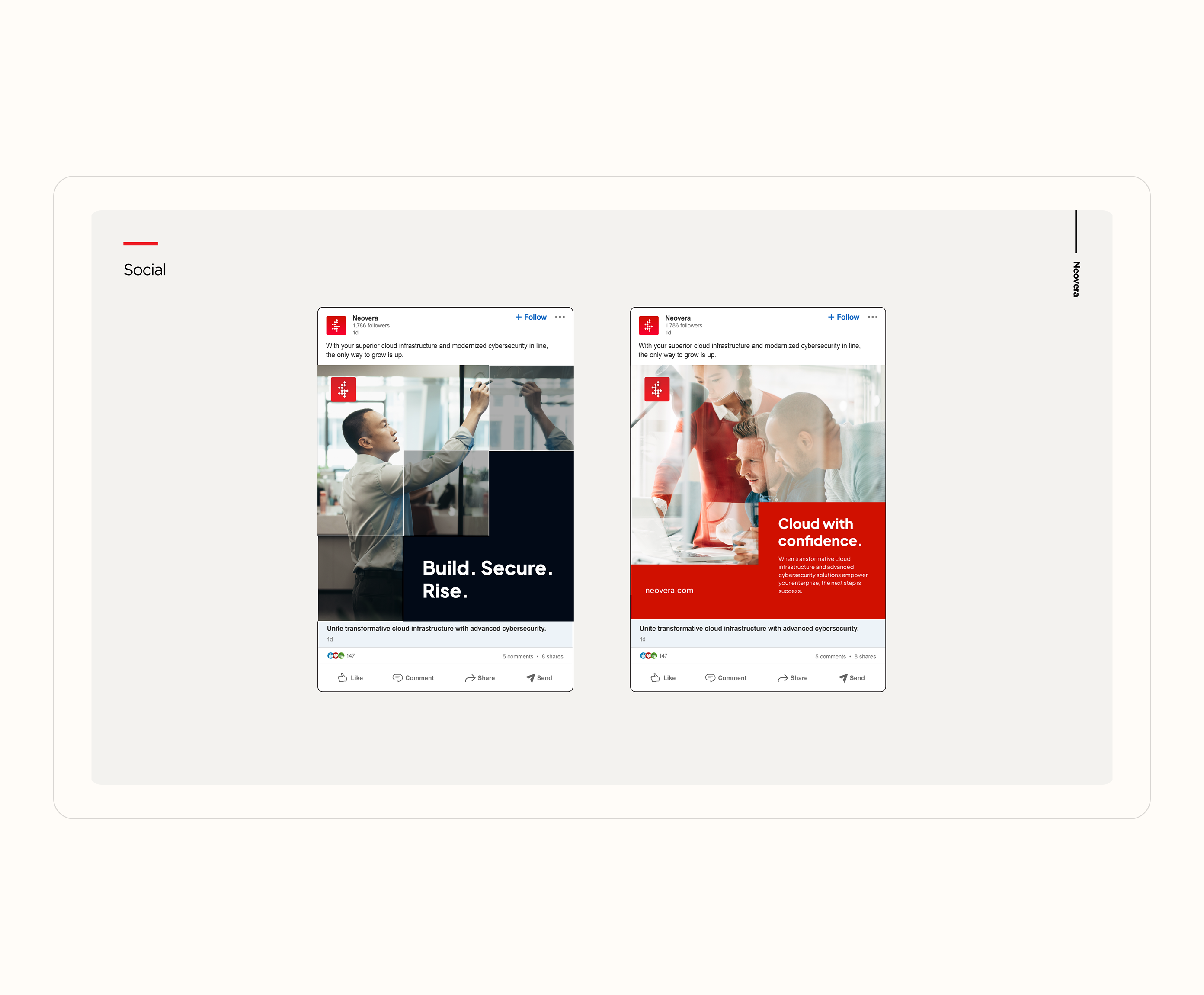
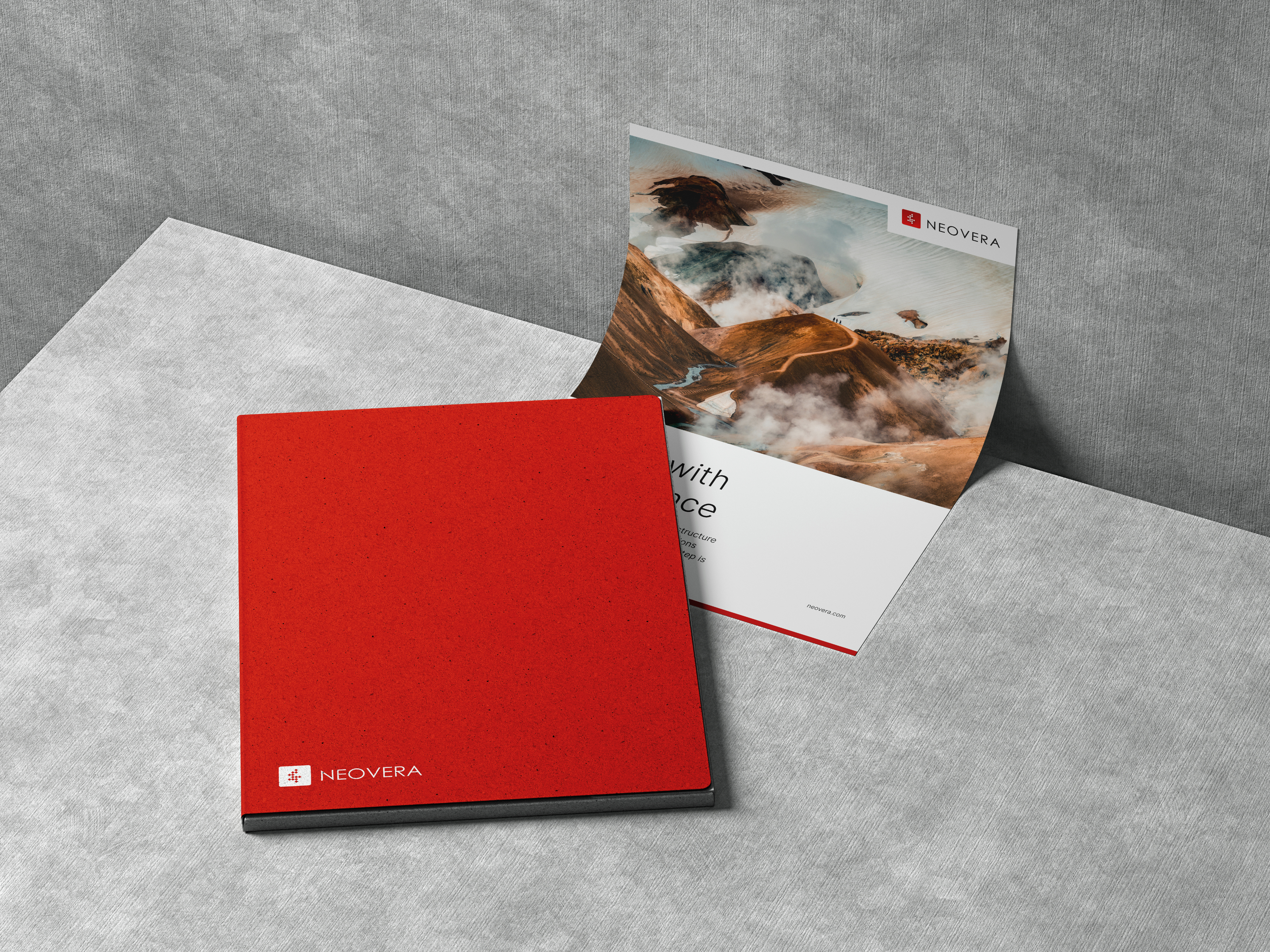
To complement this, I introduced imagery that reflects motivation and progress. This included visuals of people climbing mountains, achieving goals, or engaging in meaningful communication - symbolizing ambition, growth, and connection. Together, these elements helped communicate the company’s core strategic ideas in a clear and compelling way.
Visual Identity System
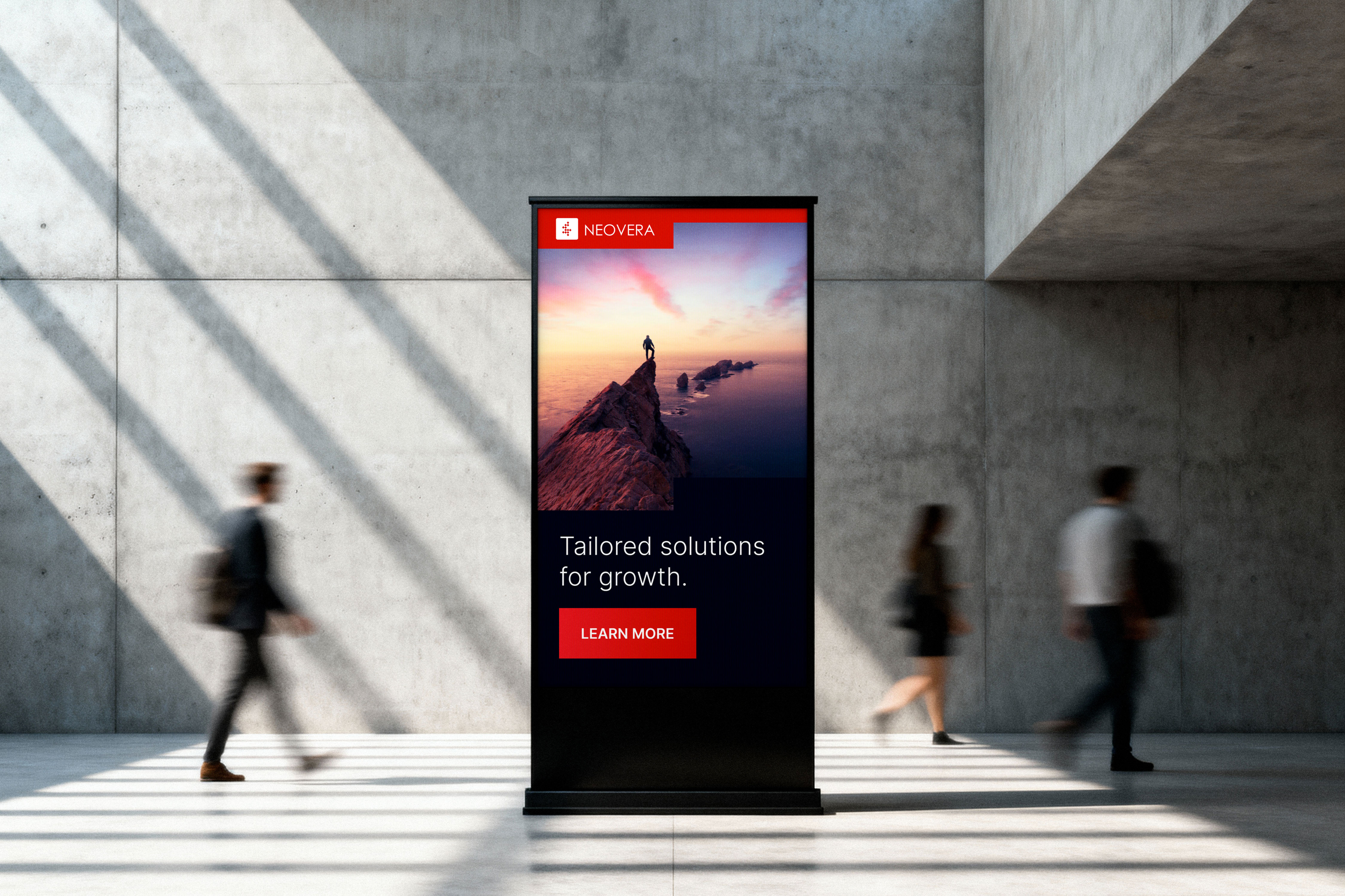
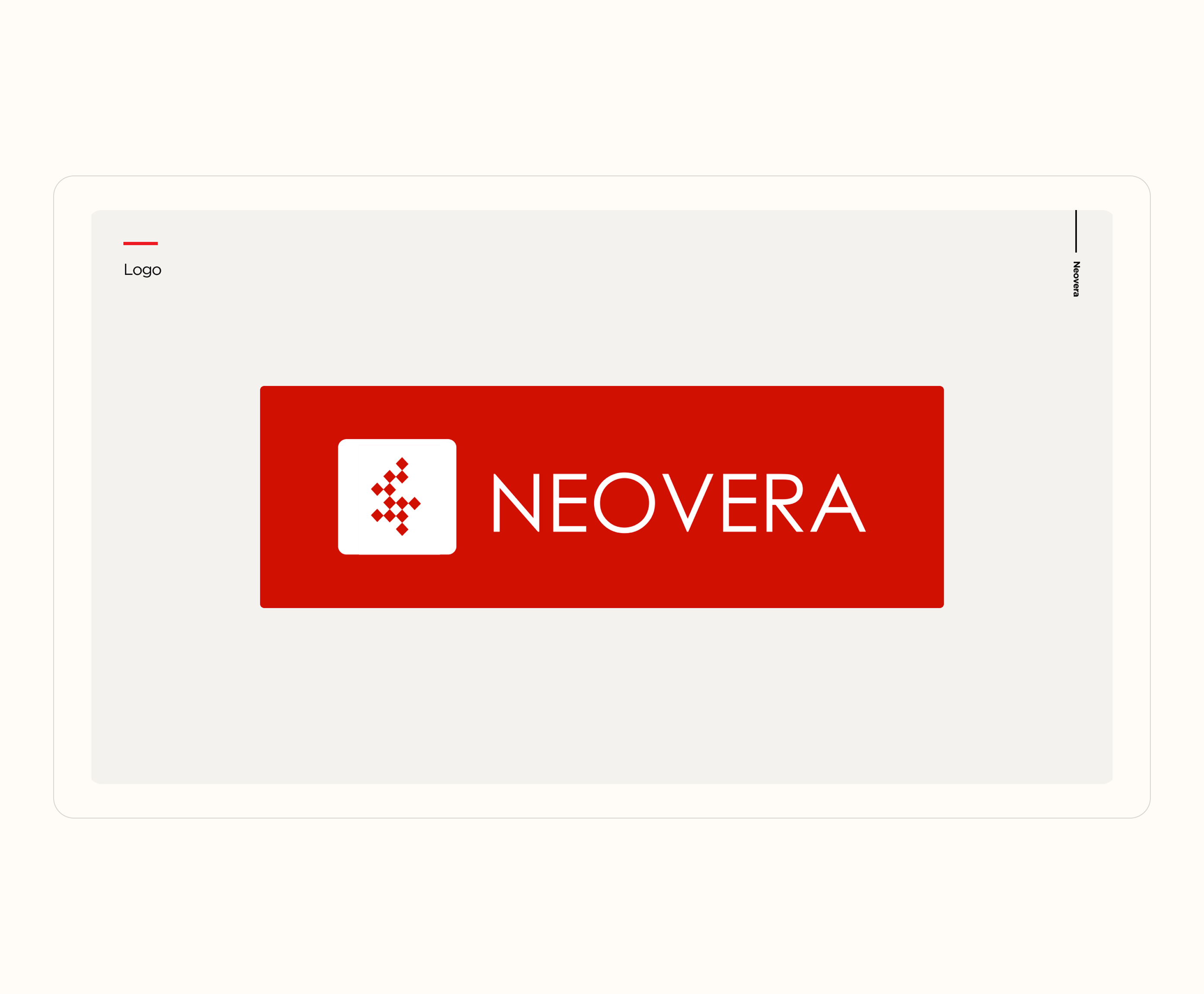
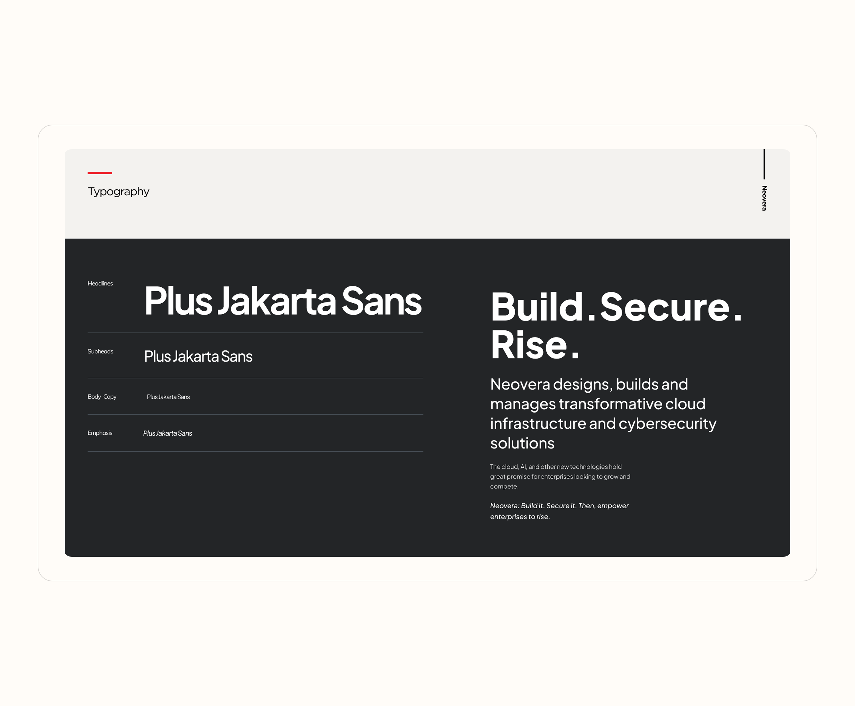
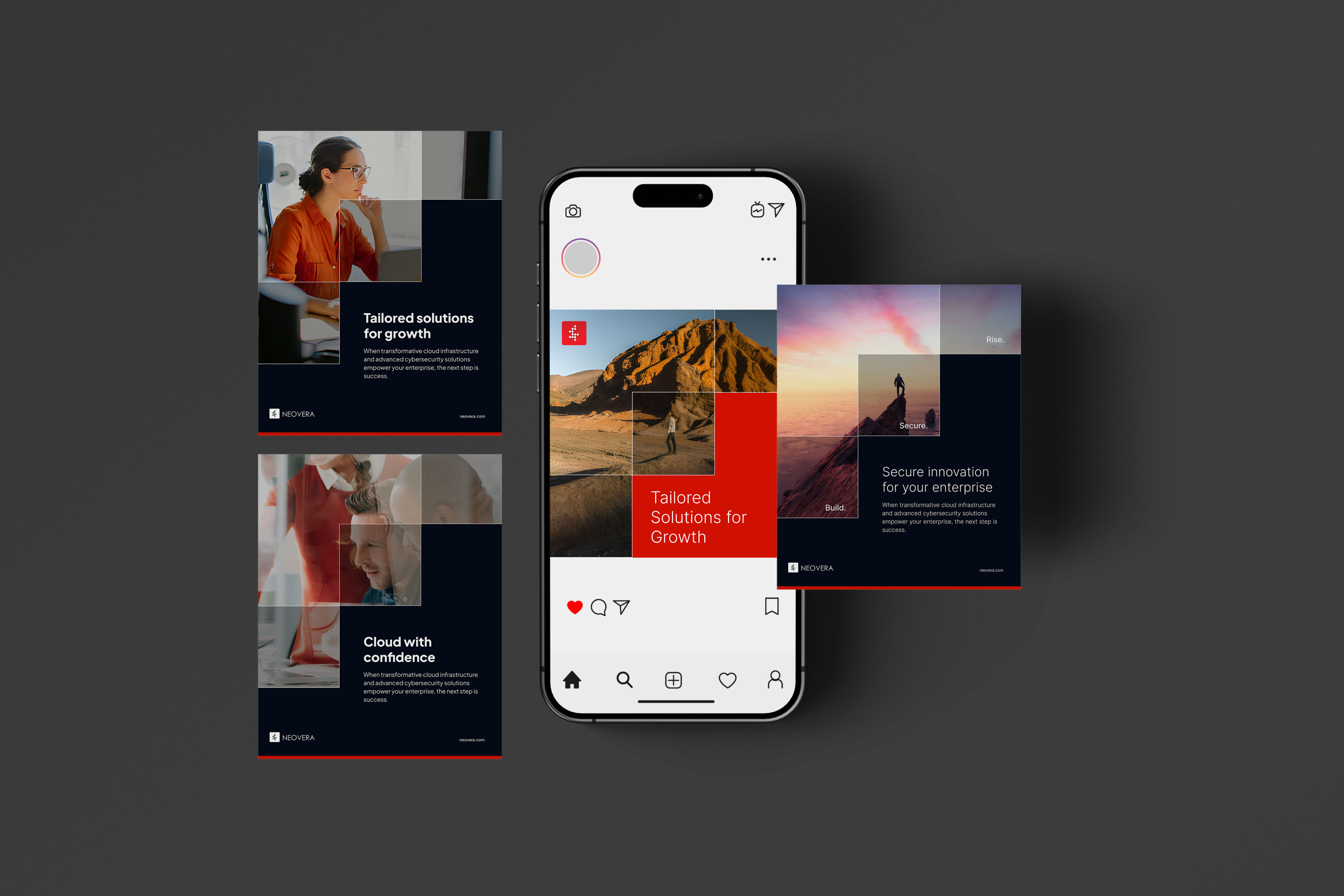
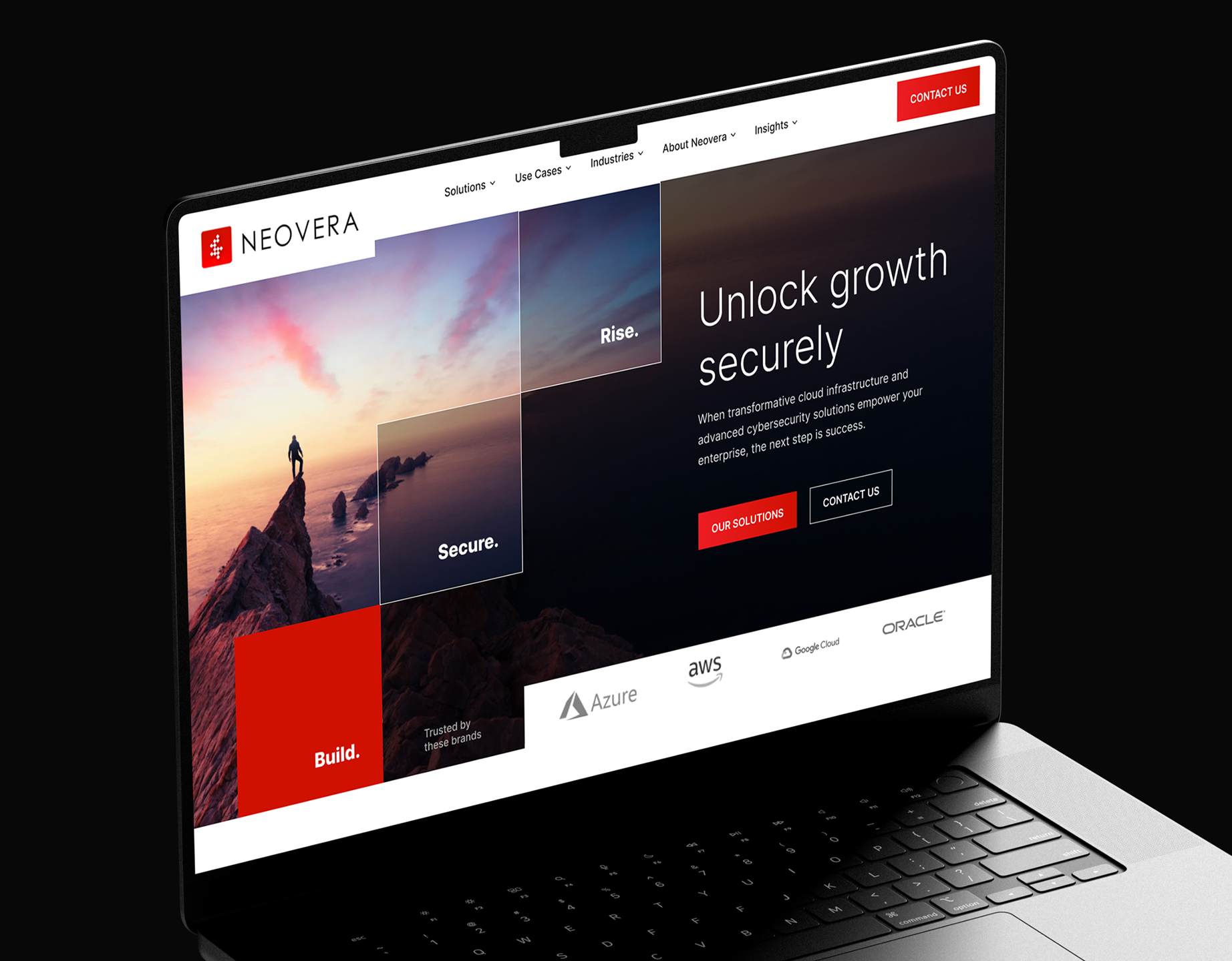
The visual identity was developed as a comprehensive system, including guidelines for logo usage, a defined color palette, and a typographic hierarchy. Templates were also created for social media posts on Instagram and Facebook, along with billboard designs for outdoor advertising and digital banners for online campaigns. In addition, a refreshed visual style was designed for the website.
Applications & Brand Book
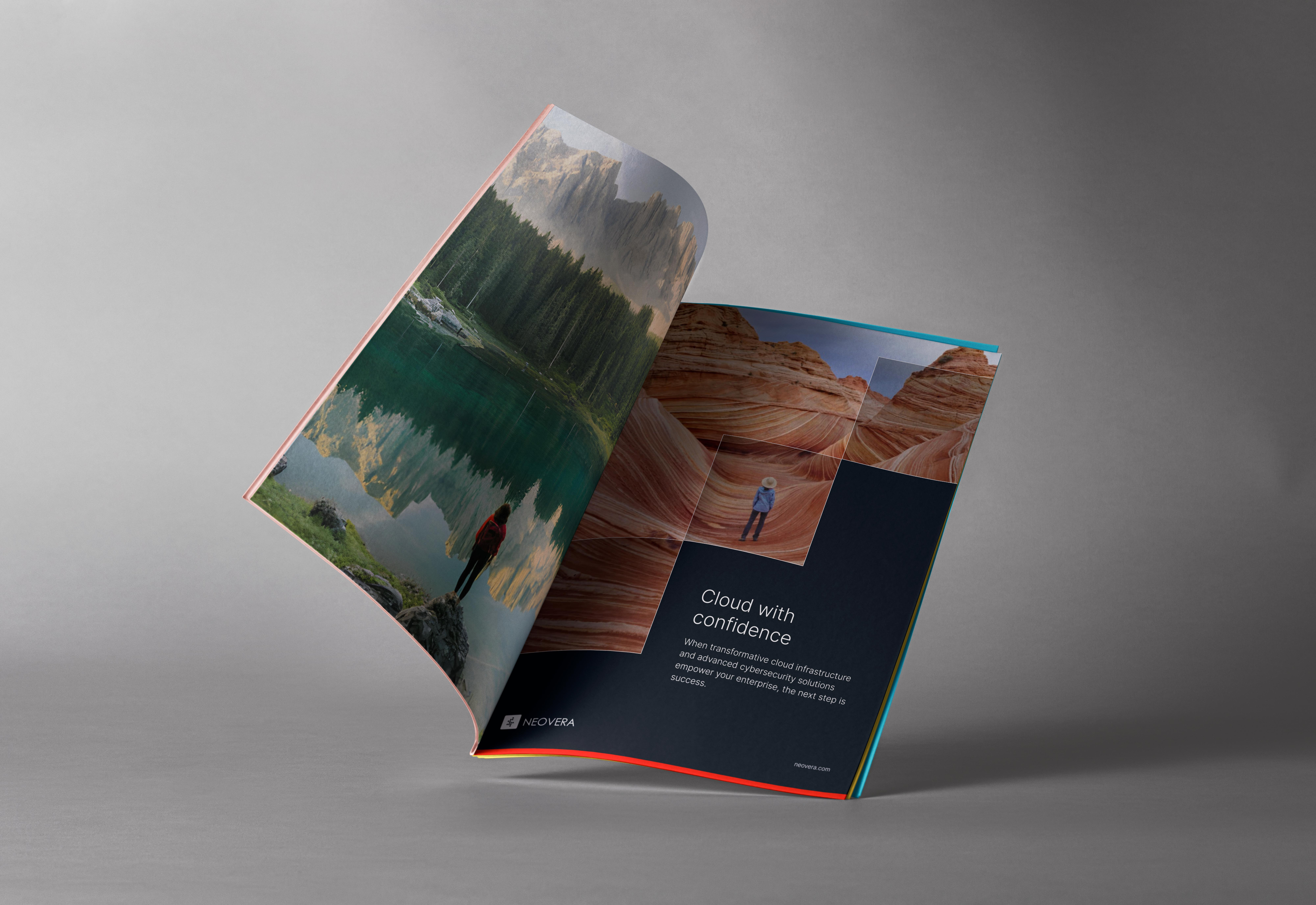
As a result, all developments were consolidated into a unified set of brand guidelines. An updated brand identity and design system were formalized in a comprehensive brand book, and the company adopted a new visual style, fully refreshing the look and feel of its social media.
view brandbook



Neovera
/15
live project
Client
Neovera
Industry
High-Tech, Cybersecurity, Cloud Infrastructure
Involvement
Brand Identity, Graphic Design, Website Design, Brand Book
task
Neovera, a company specializing in cybersecurity and data transformation, needed to create a refreshed brand identity - featuring an updated logo and a new visual style for its social media and website design.
approach
I proposed using the square - drawn from the logo - as the central graphic element to unify the brand. Building on this concept, I developed a range of visual approaches to express the brand identity across different formats, both digital and print.
Cloud applications and other new technologies offer massive advantages. You can harness your data in new – and profitable – ways, foster a more efficient workforce, and increase your agility.
Research & Insights
Before the rebranding, the company already had a recognizable identity, including its logo and the use of red as the primary brand color. After researching the specifics of the company’s work and analyzing the competitive landscape, I chose to center the new visual approach around the square as the core graphic element.
The company also had a slogan - Build. Secure. Rise.” - which can be interpreted as a journey of growth. Based on this idea, I developed a conceptual staircase built from the square form, where each step represents a word from the slogan. This system allows for a visually cohesive design that is easy to scale, adaptable across formats, and effective for both digital and print applications.
Brand Concept & Strategy
The brand strategy focused on rapidly developing and visually expressing this concept. For the visual communications, I chose a clear, minimal color palette - primarily red and black - to strengthen the brand and convey a sense of recognition, solidity, and stability.
To complement this, I introduced imagery that reflects motivation and progress. This included visuals of people climbing mountains, achieving goals, or engaging in meaningful communication - symbolizing ambition, growth, and connection. Together, these elements helped communicate the company’s core strategic ideas in a clear and compelling way.
Visual Identity System
The visual identity was developed as a comprehensive system, including guidelines for logo usage, a defined color palette, and a typographic hierarchy. Templates were also created for social media posts on Instagram and Facebook, along with billboard designs for outdoor advertising and digital banners for online campaigns. In addition, a refreshed visual style was designed for the website.
Applications & Brand Book
As a result, all developments were consolidated into a unified set of brand guidelines. An updated brand identity and design system were formalized in a comprehensive brand book, and the company adopted a new visual style, fully refreshing the look and feel of its social media.
view brandbook

Neovera
/15
live project
Client
Neovera
Industry
High-Tech, Cybersecurity, Cloud Infrastructure
Involvement
Brand Identity, Graphic Design, Website Design, Brand Book
task
Neovera, a company specializing in cybersecurity and data transformation, needed to create a refreshed brand identity - featuring an updated logo and a new visual style for its social media and website design.
approach
I proposed using the square - drawn from the logo - as the central graphic element to unify the brand. Building on this concept, I developed a range of visual approaches to express the brand identity across different formats, both digital and print.
Cloud applications and other new technologies offer massive advantages. You can harness your data in new – and profitable – ways, foster a more efficient workforce, and increase your agility.
Research & Insights
Before the rebranding, the company already had a recognizable identity, including its logo and the use of red as the primary brand color. After researching the specifics of the company’s work and analyzing the competitive landscape, I chose to center the new visual approach around the square as the core graphic element.
The company also had a slogan - Build. Secure. Rise.” - which can be interpreted as a journey of growth. Based on this idea, I developed a conceptual staircase built from the square form, where each step represents a word from the slogan. This system allows for a visually cohesive design that is easy to scale, adaptable across formats, and effective for both digital and print applications.
Brand Concept & Strategy
The brand strategy focused on rapidly developing and visually expressing this concept. For the visual communications, I chose a clear, minimal color palette - primarily red and black - to strengthen the brand and convey a sense of recognition, solidity, and stability.
To complement this, I introduced imagery that reflects motivation and progress. This included visuals of people climbing mountains, achieving goals, or engaging in meaningful communication - symbolizing ambition, growth, and connection. Together, these elements helped communicate the company’s core strategic ideas in a clear and compelling way.
Visual Identity System
The visual identity was developed as a comprehensive system, including guidelines for logo usage, a defined color palette, and a typographic hierarchy. Templates were also created for social media posts on Instagram and Facebook, along with billboard designs for outdoor advertising and digital banners for online campaigns. In addition, a refreshed visual style was designed for the website.
Applications & Brand Book
As a result, all developments were consolidated into a unified set of brand guidelines. An updated brand identity and design system were formalized in a comprehensive brand book, and the company adopted a new visual style, fully refreshing the look and feel of its social media.
view brandbook
