


IMO Health
/13
live project
Client
IMO Health, Solid Digital
Industry
MedTech, Data Management, AI, NLP
Involvement
UI/UX Design, Graphic Design, Design System
task
Russell Westbrook III is an American professional basketball player for the Sacramento Kings of the National Basketball Association. The task was to create an updated style for the existing website of his company, which deals with many areas of work such as a busseniss and
approach
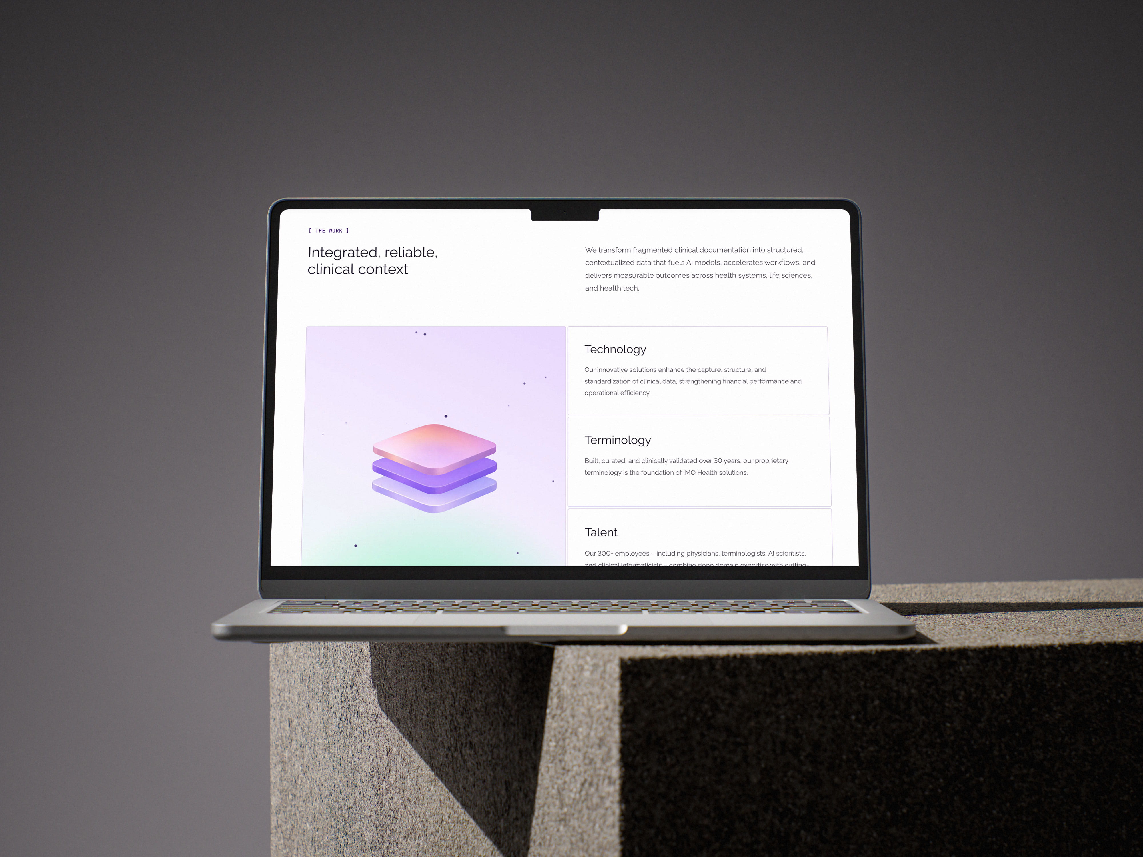
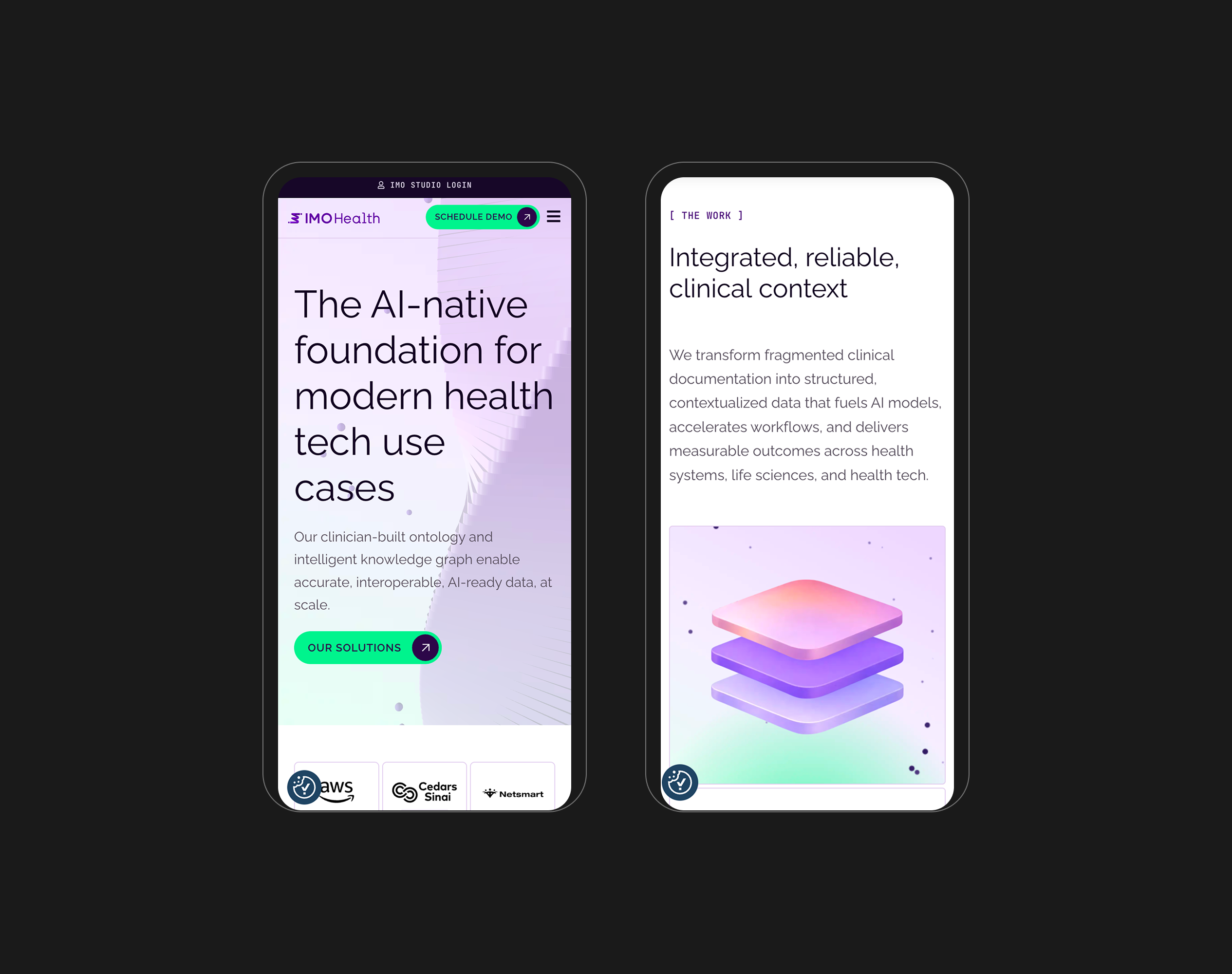
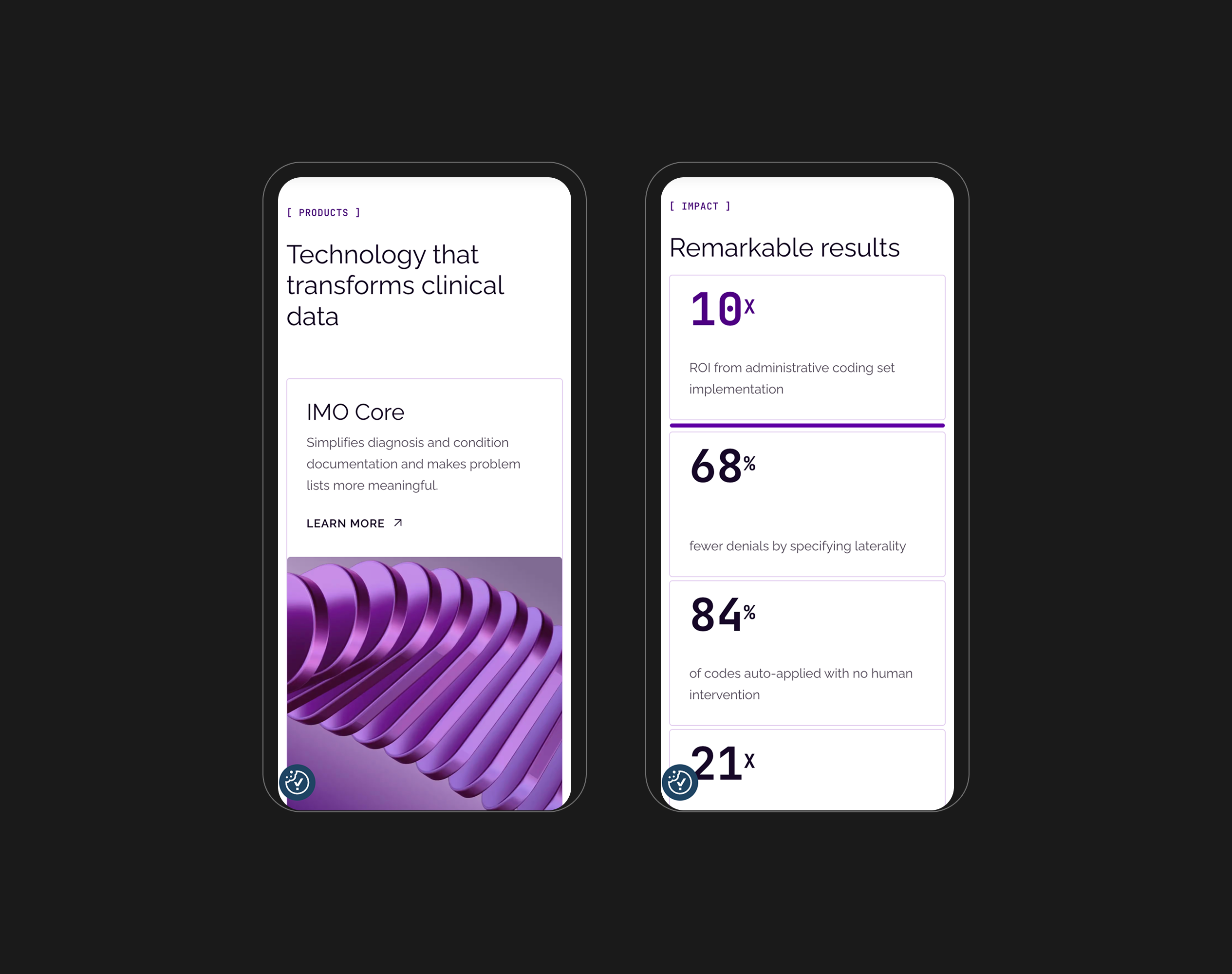
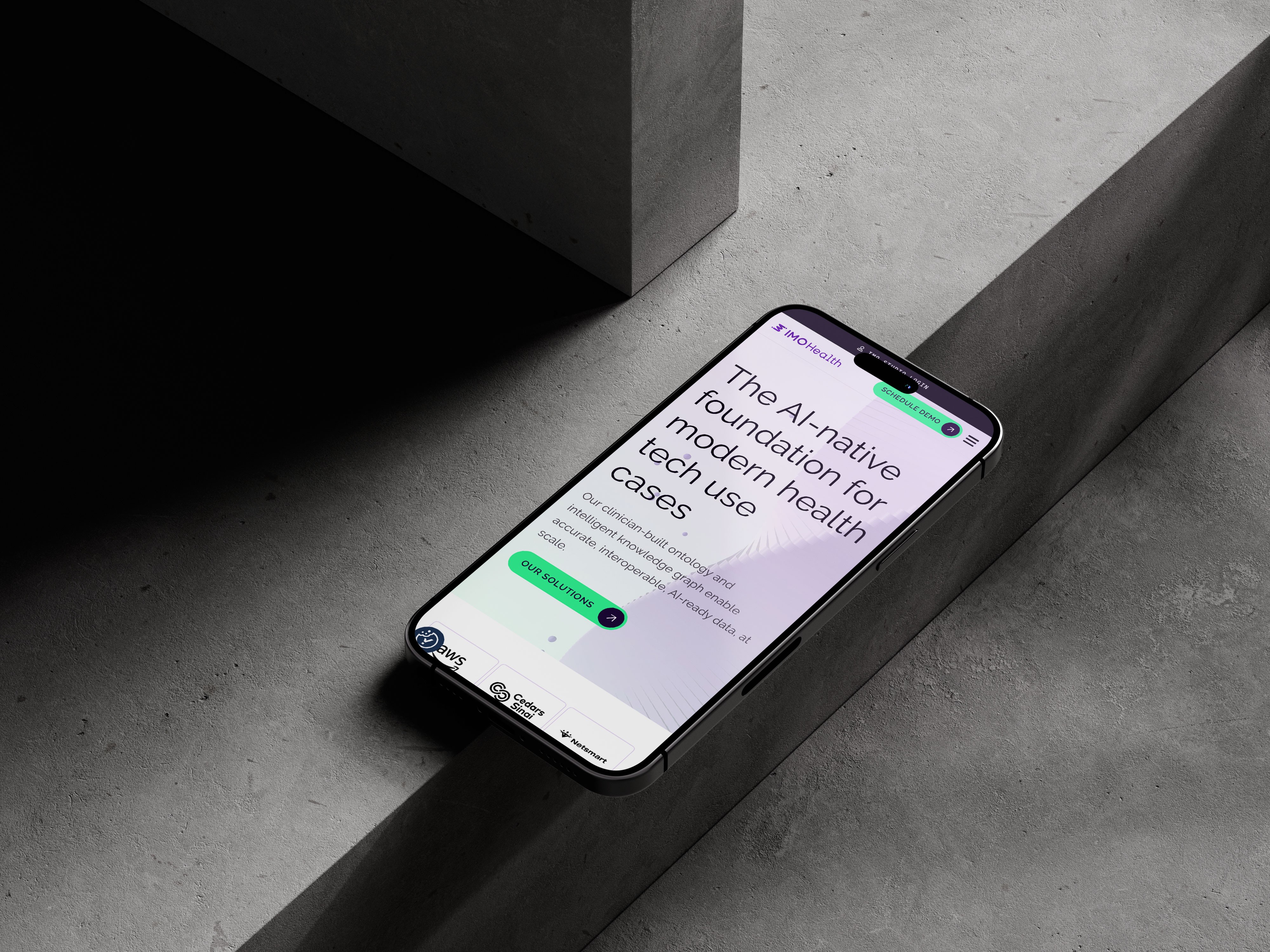
My proposal focused on creating a clean, lightweight interface that captures attention through its structure, communicates transformation through technology, and remains visually appealing. I also suggested shifting the company’s visual identity from a dark theme to a lighter one to create a more welcoming and approachable experience.
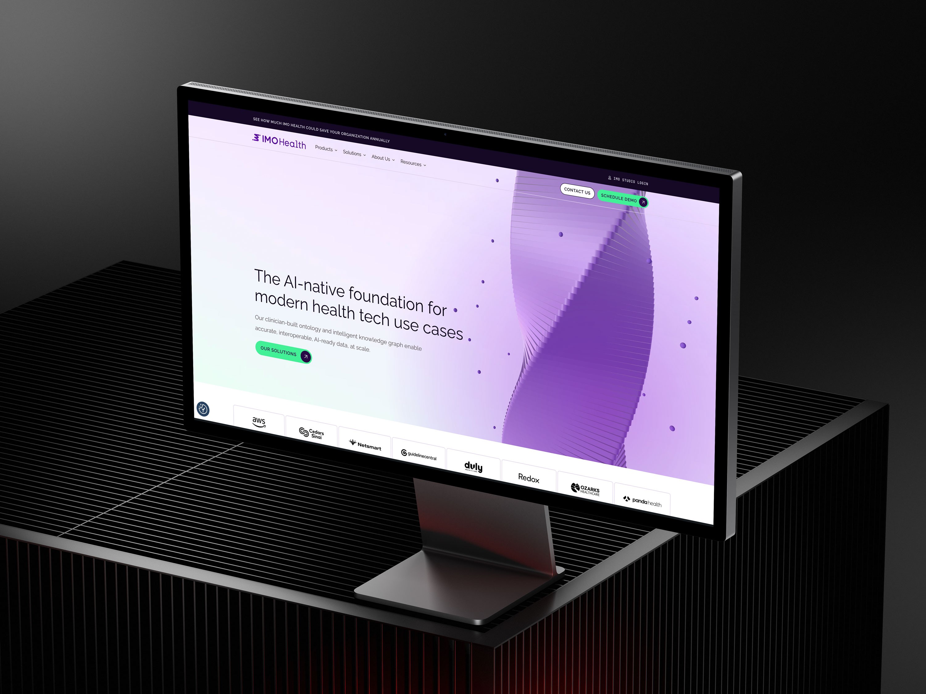
The AI-native foundation for modern health tech use cases. Our clinician-built ontology and intelligent knowledge graph enable accurate, interoperable, AI-ready data, at scale.
Design Concept
Taking into account the company’s focus on data management and transformation through AI, I proposed visualizing this process as a 3D object—animated and composed of clustered points of information that come together like molecules to form a cohesive structure. A soft palette featuring a light purple-to-green gradient enhances the interface’s approachability and visual appeal, while a clean sans-serif typeface reinforces a sense of precision, clarity, and intelligence aligned with the platform’s purpose.
Micro interection and animation
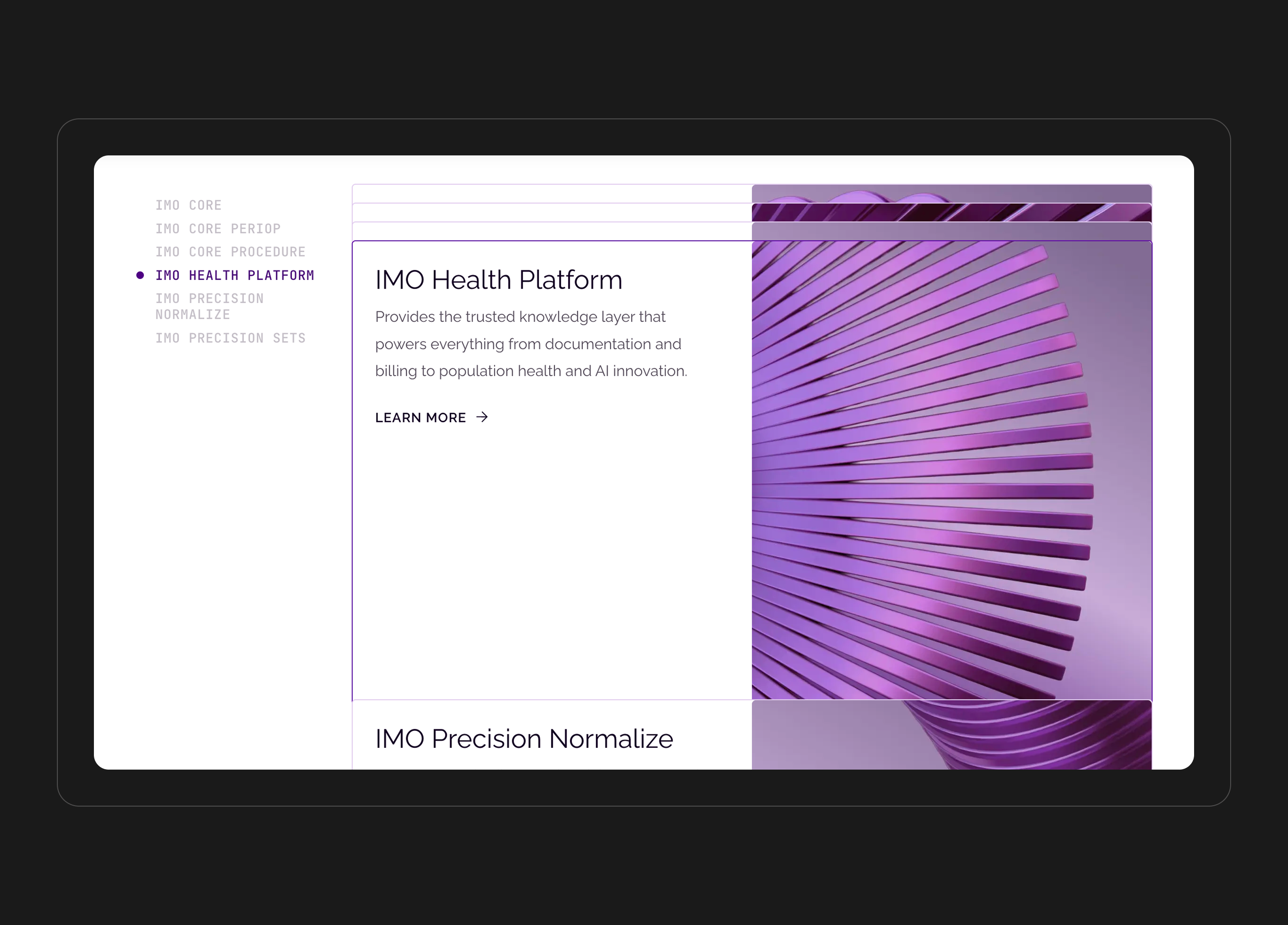
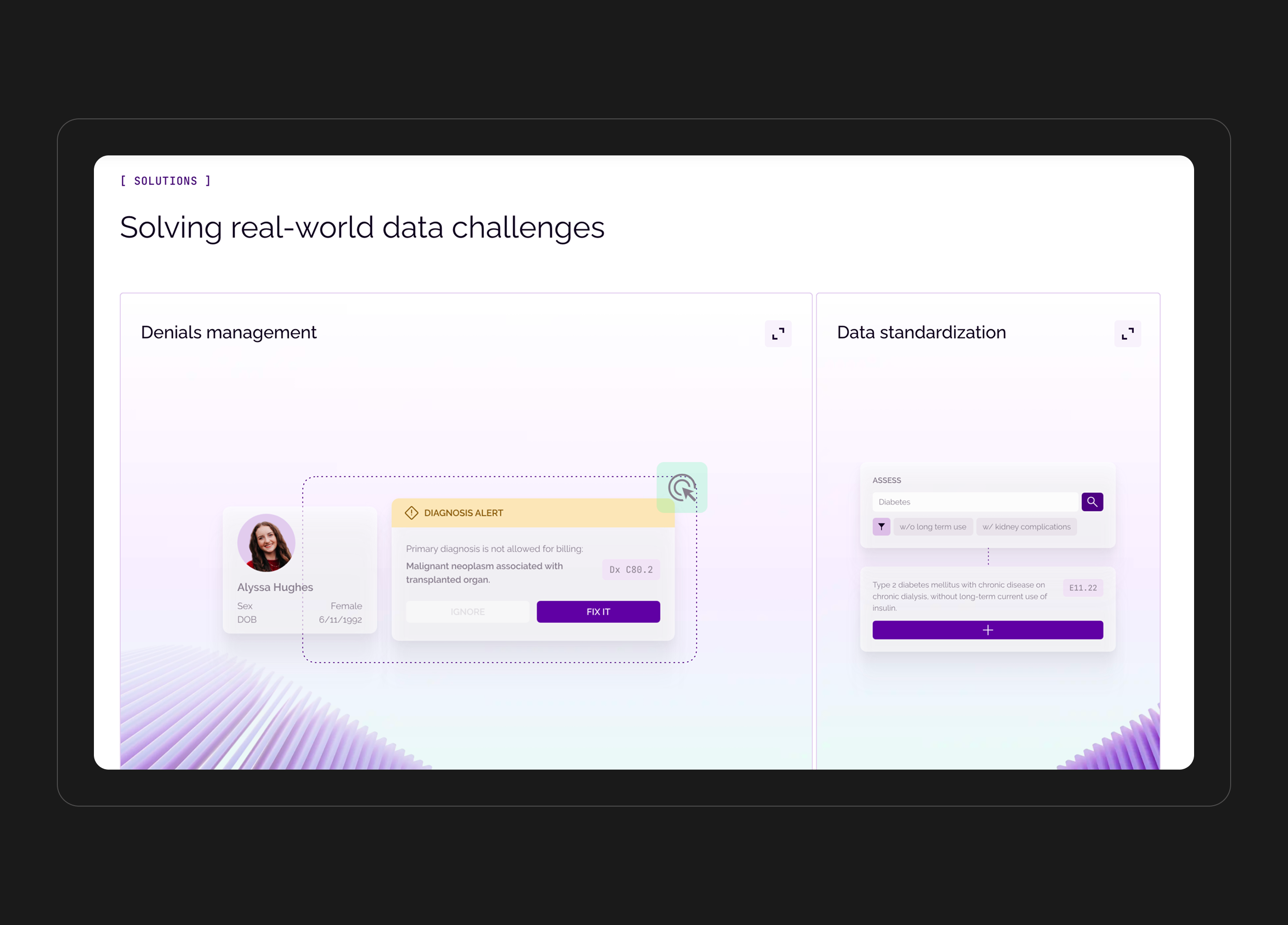
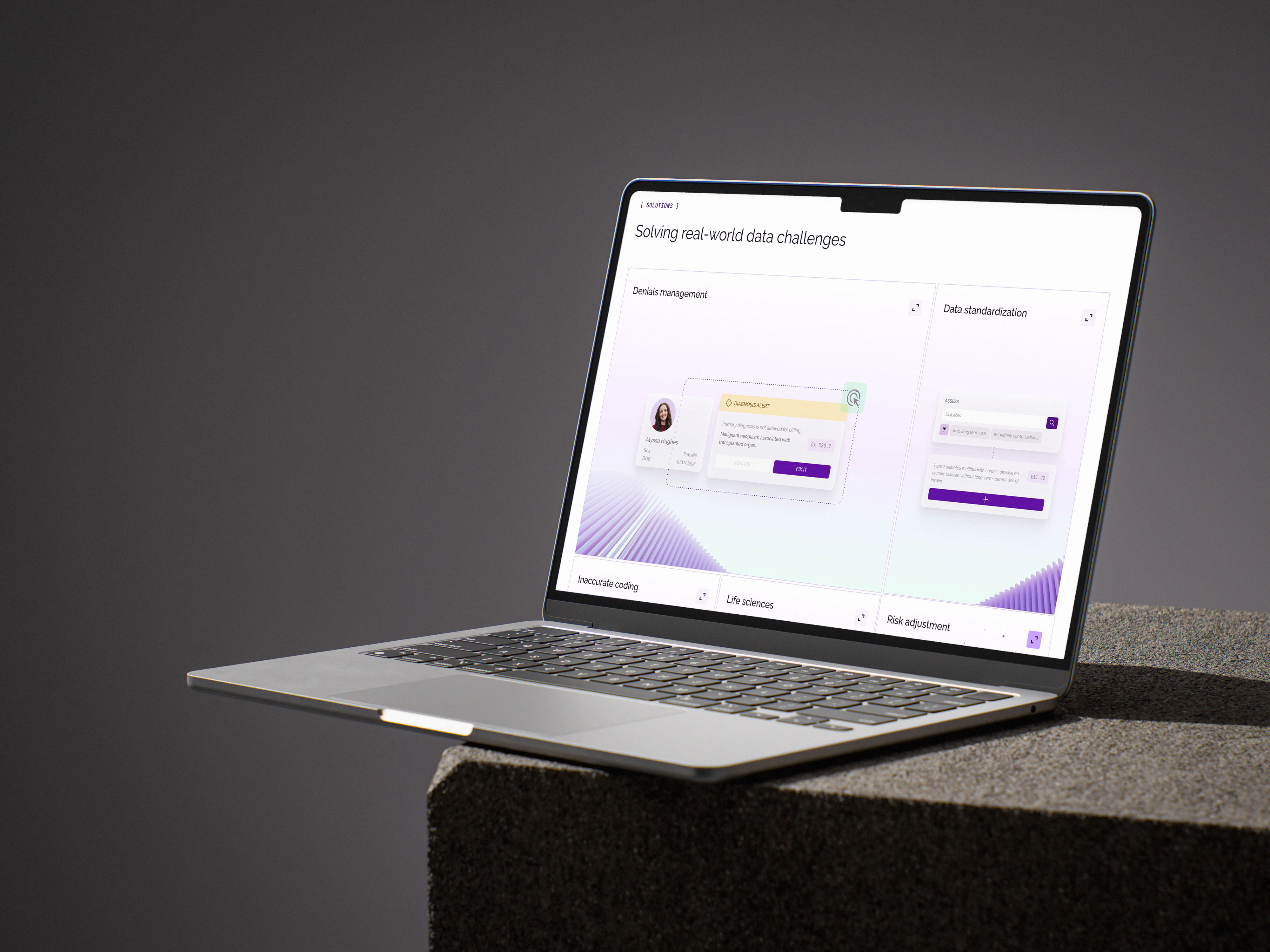
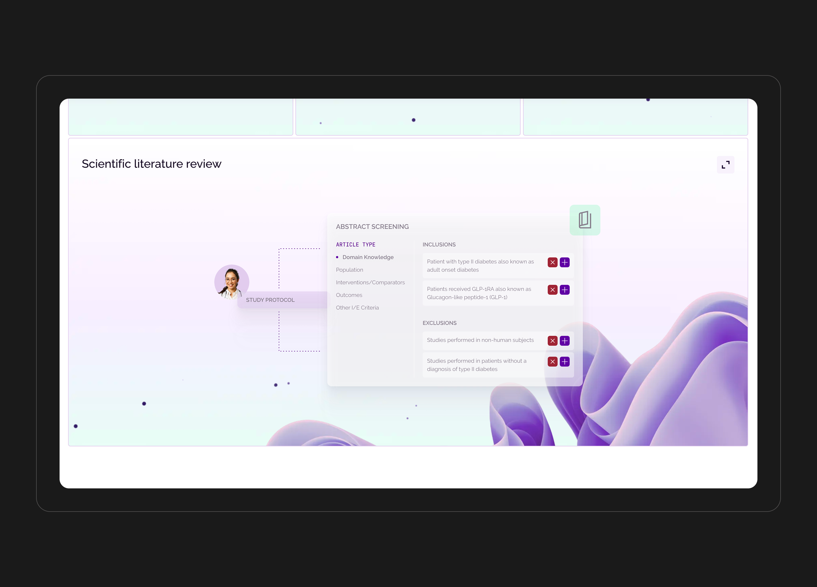
Building on this, the use of micro-animations and dynamic visuals helps create an engaging, active experience—guiding users’ attention at key moments and subtly indicating where to take action. Together, these elements form a cohesive concept that presents the brand as a forward-thinking, high-tech company.These details help guide attention within complex infographics and interface layouts, highlighting key elements and directing users toward important actions.
Website navigation
The site’s navigation is straightforward, featuring two levels of hierarchy. The main menu is fixed in the header, ensuring constant access, and is complemented by a modal window with its own structured set of links for quick navigation and easy access to key content. Additional links within specific sections help establish a clear information architecture and guide users smoothly through the site.
Result
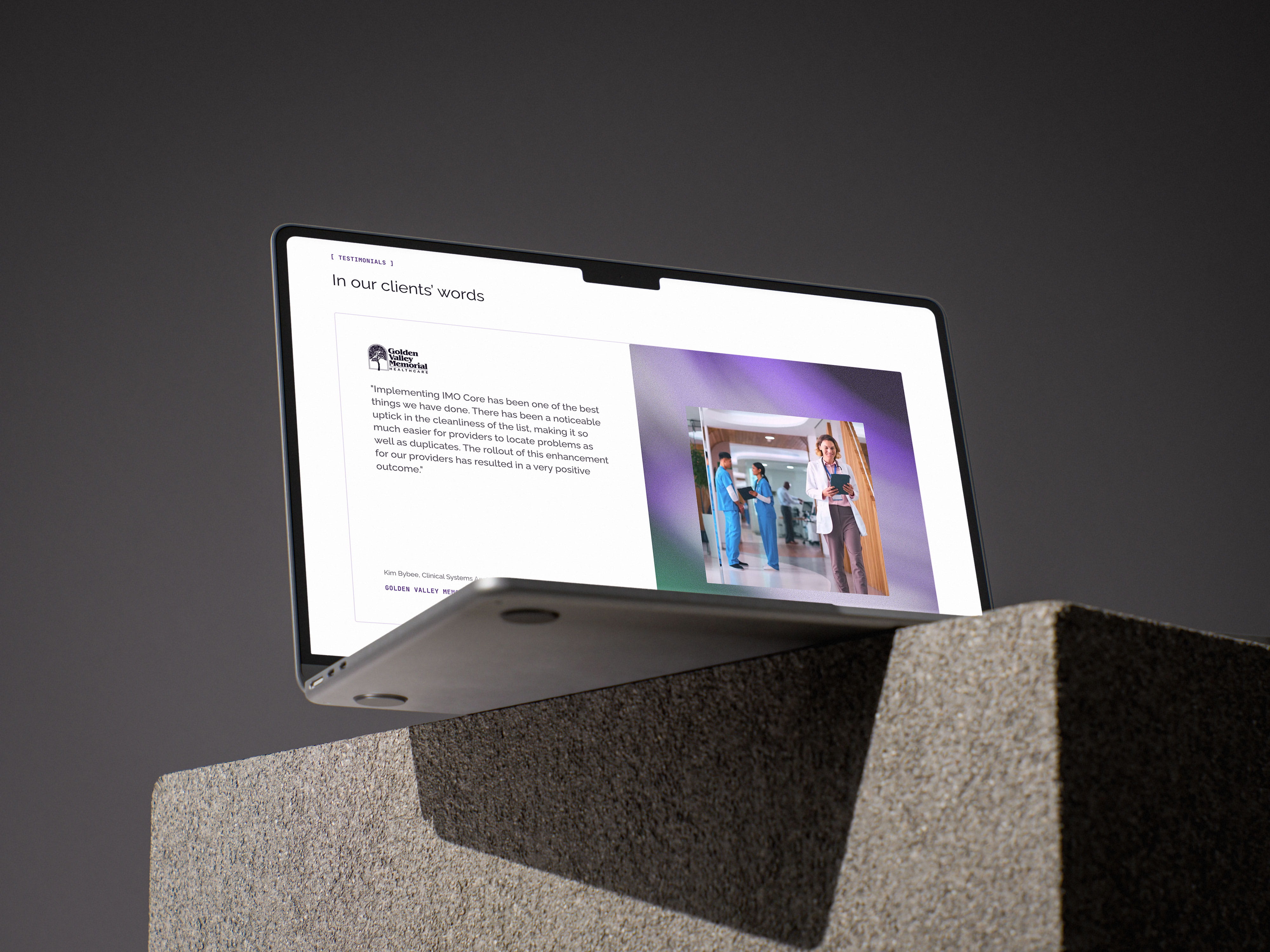
The result of the project was the launch of a redesigned website, where the brand’s visual focus shifted from infographics and product interface displays to a more human-centered approach - placing people at the core of data analysis and structuring processes powered by AI.


IMO Health
/13
live project
Client
IMO Health, Solid Digital
Industry
MedTech, Data Management, AI, NLP
Involvement
UI/UX Design, Graphic Design, Design System
task
Russell Westbrook III is an American professional basketball player for the Sacramento Kings of the National Basketball Association. The task was to create an updated style for the existing website of his company, which deals with many areas of work such as a busseniss and
approach
My proposal focused on creating a clean, lightweight interface that captures attention through its structure, communicates transformation through technology, and remains visually appealing. I also suggested shifting the company’s visual identity from a dark theme to a lighter one to create a more welcoming and approachable experience.
The AI-native foundation for modern health tech use cases. Our clinician-built ontology and intelligent knowledge graph enable accurate, interoperable, AI-ready data, at scale.
Design Concept
Taking into account the company’s focus on data management and transformation through AI, I proposed visualizing this process as a 3D object—animated and composed of clustered points of information that come together like molecules to form a cohesive structure. A soft palette featuring a light purple-to-green gradient enhances the interface’s approachability and visual appeal, while a clean sans-serif typeface reinforces a sense of precision, clarity, and intelligence aligned with the platform’s purpose.
Micro interection and animation
Building on this, the use of micro-animations and dynamic visuals helps create an engaging, active experience—guiding users’ attention at key moments and subtly indicating where to take action. Together, these elements form a cohesive concept that presents the brand as a forward-thinking, high-tech company.These details help guide attention within complex infographics and interface layouts, highlighting key elements and directing users toward important actions.
Website navigation
The site’s navigation is straightforward, featuring two levels of hierarchy. The main menu is fixed in the header, ensuring constant access, and is complemented by a modal window with its own structured set of links for quick navigation and easy access to key content. Additional links within specific sections help establish a clear information architecture and guide users smoothly through the site.
Result
The result of the project was the launch of a redesigned website, where the brand’s visual focus shifted from infographics and product interface displays to a more human-centered approach - placing people at the core of data analysis and structuring processes powered by AI.

IMO Health
/13
live project
Client
IMO Health, Solid Digital
Industry
MedTech, Data Management, AI, NLP
Involvement
UI/UX Design, Graphic Design, Design System
task
IMO Health is a healthcare data company that uses advanced medical terminology and AI to turn unstructured clinical information into actionable insights, helping improve decision-making and patient care. The task was to design a website style that reflects the company’s advanced technological capabilities and broad scope, with a strong focus on AI-driven healthcare and medical innovation.
approach
My proposal focused on creating a clean, lightweight interface that captures attention through its structure, communicates transformation through technology, and remains visually appealing. I also suggested shifting the company’s visual identity from a dark theme to a lighter one to create a more welcoming and approachable experience.
The AI-native foundation for modern health tech use cases. Our clinician-built ontology and intelligent knowledge graph enable accurate, interoperable, AI-ready data, at scale.
Design Concept
Taking into account the company’s focus on data management and transformation through AI, I proposed visualizing this process as a 3D object—animated and composed of clustered points of information that come together like molecules to form a cohesive structure. A soft palette featuring a light purple-to-green gradient enhances the interface’s approachability and visual appeal, while a clean sans-serif typeface reinforces a sense of precision, clarity, and intelligence aligned with the platform’s purpose.
Micro interection and animation
Building on this, the use of micro-animations and dynamic visuals helps create an engaging, active experience—guiding users’ attention at key moments and subtly indicating where to take action. Together, these elements form a cohesive concept that presents the brand as a forward-thinking, high-tech company.These details help guide attention within complex infographics and interface layouts, highlighting key elements and directing users toward important actions.
Website navigation
The site’s navigation is straightforward, featuring two levels of hierarchy. The main menu is fixed in the header, ensuring constant access, and is complemented by a modal window with its own structured set of links for quick navigation and easy access to key content. Additional links within specific sections help establish a clear information architecture and guide users smoothly through the site.
Result
The result of the project was the launch of a redesigned website, where the brand’s visual focus shifted from infographics and product interface displays to a more human-centered approach - placing people at the core of data analysis and structuring processes powered by AI.
